Gareth A Hopkins
email: gareth@grthink.com

These pages will be kept updated with forthcoming gallery shows and news on completed artwork.

Pages from my ongoing surreal/abstracted comic 'The Intercorstal' can be found here: The Intercorstal

My deviantart gallery, chock-full of my art, can be found here: grthink

Stories from my (old) walk to and from work can be found here: Trolleys In Odd Places

Wednesday 18 August 2010

'grthinking'


I've been reminiscing over the past few days about the large, A2 pictures I used to do. Everything I've done recently has been small -- Intercorstal pages are A5, illustrations for Amelia's Magazine are usually about that too, I did all those postcards...

The main reason I've not been doing big pictures is because I've not got the space anymore, or the time -- having a baby in the house really reduces that space you've got, and as I work on the dining table, I've got to pack everything up in between sessions. Hopefully I'll get around to doing another big picture soon, using some of the things I've learnt over the last few months. In the meantime, here's some of my favourites from over the years...


Friday 13 August 2010

Jesse Tise's Space Spells

A rare departure from talking about myself...

Jesse Tise is an illustrator that I 'met' a few years ago on DeviantArt. His work's always impressed me, but in the last few months it's got stronger and stronger -- his degree's really paying off :) He's just printed a 'zine called Space Spells and sent me a copy, and I have to admit that it blew me away a little bit.

It's been printed on crisp fresh newsprint which perfectly compliments the slightly grainy illustrations. Although it's based on an album by Flying Lotus I can't help drawing parrallels and comparisons between Space Spells and my own project, The Intercorstal -- it's got a recurring character, it's both shallow and deep at the same time, it features a healthy does of semi-magical symoblism... On top of that, it's got a kind of 50's, Jetsons vibe to it...

In short, I love it. You should get in contact with him via his website and see if he's got any left. You should do that now. Here's a couple of my favourite images from the book (lifted off the website)

Wayne Hemingway Process

This illustration of Wayne Hemingway was done for an article at Amelia's Magazine about 'Vintage at Goodwood'. It started off as a portrait done in the same style as my recent ones of Alan Moore and John Stonehouse, but Amelia suggested I try using colour... two hours of the paintpot tool in Photoshop and this is what we get. I don't know what possessed me to go with such a lurid blue... all the other coulours are relatively tame (well, except the reds and pinks in the words). Below are the original black and white ink drawing, and the photo I worked from.

Tuesday 3 August 2010

Process for Unearthing Blog (potentially uninteresting)

I recently attended the performance of the multimedia collaboration 'Unearthing' by Alan Moore, Mitch Jenkins, Adam Drucker and Andy Broder, and wrote a blog about it for Amelia's Magazine. I also did two illustrations (posted here) and grabbed some stills from some video.

The illustration of Alan Moore was relatively straightforward (posted above). I had in mind the starting image I wanted to use, and that I wanted to do it in the style I'd used for my Jon Stonehouse image for Cut-Click's mailart exhibition. Once I'd pencilled the broad features in, everything else fell into place. I was going to include a lot more text, but when it comes to Alan Moore, what do you choose? In the end, I just put the word 'Gods' above his right eye (referencing his use of Magick and one of the themes of 'Unearthing') and stuck a 'V' in there (as in 'V For Vendetta', but I suppose at a stretch it could also reference Thomas Pynchon's 'V.', which Moore is apparently a fan of.). There's also two ghosts snuck in there. I actually did most of the beard inbetween multiplayer matches of Bioshock 2.

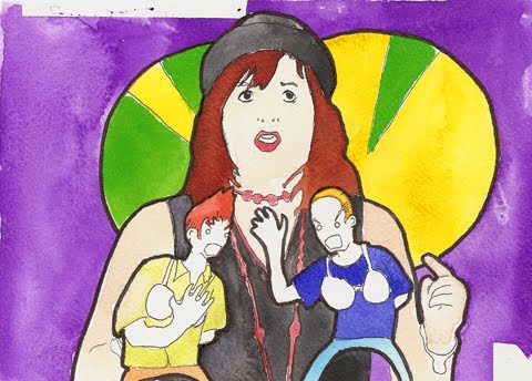
The one of Crook&Flail (below) was more difficult. Crook&Flail is the moniker under which Adam Drucker and Andy Broder composed the music for 'Unearthing'. There's one image of them together as Crook&Flail out there on the internet that I could find, and it wasn't very interesting, and I couldn't work from it very easily, so I went looking for images of them apart which I could combine. There are loads of Drucker (who also goes under the psedonym Doseone) many of which I was familiar with already, but none were really suitable, and there are very few of Broder. I ended up trawling Flickr for images I could use... I really should have tracked back to their owners (job for later this week). I wasn't happy with the composition at first, to the point where half-way through I was going to give up, but a session of working on it in front of Ghost Dog set me right. The reliance on black and white stripes was intentional, for two reasons: 1) Referencing the style of the Egyptian Crook&Flail that they're named after 2) Alluding to Doseone's old band Subtle.

I decided not to do an illustration of Mitch Jenkins because... well, it din't occur to me. That's kind of awful. Maybe I'll do one and add it here, then retcon this blog post to look like I'd done it all along?

The still was taken from a video I took with my new favourite toy, and Flip camera my Dad got me for my birthday. I only filmed about 30 seconds of the performance, because I realised that the screen, as I was looking at it, was lighting up my face, and making me very obvious to the performers.

I had a very hard time writing the blog, though. It was the most concentrated piece of writing, other than emails, I'd done in a very long time (probably since Nanowrimo 2006). Progress was hampered by: 1) the fact that I had so much that I wanted to write about, but couldn't get it all down succinctly enough* 2) the notes I'd taken got put through the washing 3) the time I'd set aside to write got eaten up by getting slightly drunk at a BBQ and falling asleep on the living room floor. Similar to my problems with the Crook&Flail illustration, it came down in the end to just holing myself up on Sunday night after my wife and son were asleep and banging on the keys until I was happy enough to send it (adding the usual caveats in the submission email to Amelia that if she wanted to reject it, she could).

To my relief it was posted. (HERE, IF YOU'VE NOT FOLLOWED THE LINK ABOVE YET) Since it was posted, I've of course noticed things that were wrong, or I'd change now. But it remains something I'll be proud of for a long time now, whether anybody else reads it or not.

* One thing I desperately wnated to shoe-horn in, but wasn't sure whether Amelia's audience would appreciate is the fact that Ciaran O'Keefe was in the audience! I clocked him as he walked past and desperately wanted to run over and shake his hand and tell him how much I respect his work despite the fact that Most Haunted gets worse by the episode (and that I haven't watched it for about a year)... but I was having a conversation with a chap named Ben and the moment passed.

Monday 2 August 2010

Ghosts Playing Ping-Pong


Not too long ago I submitted the above image to Sandra Dieckmann's ongoing Haus Stories project. It's a brilliant idea -- artists/illustrators create a floor, or story/storey, which gets added to the 'house', leading to a ridiculously tall building.

How they ended up playing ping-pong, I'm still not entirely sure. When I started, I knew I wanted to make a haunted room, with my usual trio of ghosts, and I also wanted to make it as 'classically surreal' as possible -- most of the objects in the room, including the door and the window on the left, have been subverted somehow so that their original purpose is invalid. And at somepoint I added a net to the table, a ball in mid air and paddles to the ghosts... Reviewing it now, I totally missed out on the opportunity to include some cheese in there somewhere...

Amelia's contribution round-up

Over the past few weeks, I've been pretty busy with various things, in particular doing odds and ends for Amelia's
Magazine
. Here's a quick round-up (in no particular order):

I did this picture of comedienne Deborah Francis White as part of a round up of the comedy tent at Latitude Festival, as well as one of Adam Lambert.

This image was done for an article about a Q&A with Peter Blake, and I also did a portrait of him, which you can see by following this like: LINK The St Pepper's thing was in response to the fact that apparently, Blake is tired of talking about the cover he did for St Pepper's Lonley Hearts Club Band (which is covered in the article) -- it's very different to what I normally do, because it doesn't include using a pen ANYWHERE.

I've also had a contributor's profile added to the site. I spent as long looking for a picture of myself that I didn't hate as I spent on the illustrations for the Peter Blake article, and looking back, I still look like a bit of a numpty.