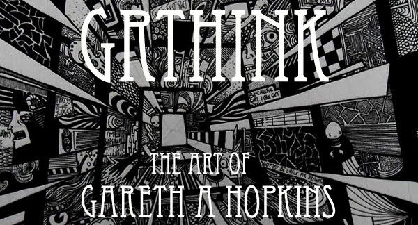
Gareth A Hopkins
email: gareth@grthink.com

These pages will be kept updated with forthcoming gallery shows and news on completed artwork.

Pages from my ongoing surreal/abstracted comic 'The Intercorstal' can be found here: The Intercorstal

My deviantart gallery, chock-full of my art, can be found here: grthink

Stories from my (old) walk to and from work can be found here: Trolleys In Odd Places
Showing posts with label witches. Show all posts

Thursday, 10 January 2013

The Intercorstal and P&O


I've just cut up a P&O Cruises brochure to get images as a starting point for another Intercorstal project, which I'll do either as the Mr Soft project finishes, or in tandem with it. This new project will be the fourth Intercorstal-related thing I've done which heavily uses P&O promotional material, having already completed:

Witches which was based on a set of 8 promotional postcards
Valentine, based on a brochure
Mr Soft, which uses cut up pages from a P&O brochure to make comics on two of the project's four final pages.

P&O isn't the only company that I've taken promotional images from as a basis to make comics -- Collider used pages from an IKEA catalogue and Butcher's Park was made from an Epic Learning brochure. Oh, and I have a sketchbook made from a Next catalogue. But why do I use these images, and why do I return to P&O so often?

I spend a fair amount of time thinking about this, although precious few people have actually ever asked me. Here's some reasons that I've come up with:

1. The Intercorstal as a project is mostly monotone, and at some point I decided that it needed some colour. I experimented with including colour in the 'traditional' pages, but was never really happy with it. The only 'released' example I can think of is "Taking Advice From Bryan Lee O'Malley" which I did for the second TwitterArtExhibit. So a way to introduce colour is to have it there already, and base the ink work on those. And I think generally it works really well, which is why I keep coming back to it.

2. Those source images are so beautiful in their own right, it seems a shame that they are so easily passed over and dismissed. They're used by the companies involved to inspire particular emotion in order to sell their product -- most people when reading these materials don't pay a great deal of attention to the pictures. Reusing them is my way of appreciating them, making them exist as objects of beauty, rather than just tools to sell cruises/furniture/etc.

3. Nobody does blue sky like P&O. That yawning expanse of pure blue is one of their biggest selling tools -- a place of opportunity, peace, hope, that people can buy into by going on one of their cruises. And it's a great tool to use when you're looking for colour to compliment and act as counterpoint to something like The Intercorstal, which is dense, complicated and often quite violent.

There's probably a hidden psychological aspect, too -- as there is with so much of my work. I mean, I've been on a couple of P&O (one of which I've blogged about here) cruises, and my wife and her family totally love them, but whether there's an emotional reason that I keep returning to them in my art, and responding to their image in the way that I do, is probably best left to a professional to decide.

Tuesday, 14 August 2012

The Intercorstal: Demos WIP

SO.

I've been away for a while. Mostly because my wife had our second child back in June and we've been adjusting to that since. Everything's lovely, just don't have as much time to focus on drawing as I'd like.

I'm getting back into the swing of things, though. Still no sign of Elipses, the collected Intercorstal edition that I've been talking about for at least a year now. But instead a brand new Intercorstal, called 'Demos'. It was called 'Epic' for a while, but I hated that. Still not sure about 'Demos', though, so that might change too. I mean, 'Witches' was called 'Sea Saw' for a while, right up until the cover was conceived, so there's an obvious benefit in not setting a title in stone until the last minute.

Anyway, when finished it'll be a 12 page comic (including the cover), based on a promotional booklet I got at an assessment conference from the company 'Epic' (see, that's where the original title came from). Once I've fiished it, I'll likely ask Art Roadie Anxietydecending to turn it into a PDF and then rather than send physical copies out I'll make it free-to-download.

Here's some photos I just took -- I've done a lot of this work sitting on the benches in Smithfields Park, and that's where these photos were taken (hence the daylight and gravel).


Friday, 18 May 2012

The Intercorstal at Heads Up, ft BATMAN

38 Pages From The Intercorstal and a Batman
I was contacted a couple of months ago by Holly from Chelmsford's Shiny Shed collective, asking if I'd be interested in taking part in a group show in Chelmsford, and I leapt at the chance. Sensing the opportunity to do somethnig a little different and push the boat out a bit, as well as having by a strange set of coincidences the space and materials required, I set about creating a wearable Batman suit out of cardboard.

I went through a bit of a 'process' with this -- I knew what I needed it to look like, but I had no idea how it would work, and while I was making it was constantly worrying that what I was making wasn't artistically valid and what have you. But filling the inside of the cape with cut-up Intercorstal panels and adding panels to the white areas on the gauntlets (which was my wife's idea, to be fair) resolved that conflict.

I could wang on about my process and what this means to me, and how it ties into The Intercorstal for ages, but I'll save that for another time. For now, I'd just like to share these photos of the work I have on show, which I'm incredibly proud of -- the photos were taken while the rest of the exhibition was still being set up, so there's still tools and coffee cups and whatnot in frame. I've added some comments on each picture, which hopefully shed some light on what's going on in my head.

Any comments, questions or crticism are heartily welcomed.

And if you're able, head down to the Heads Up show -- it's on in Chelmsford in the old Barcalys Building, at the top of the High Street, running between 19th and 27th May. All the work there is incredible, and it is a genuine honour to have been asked to participate.

Batman installed, waiting for the other pieces to be wall mounted. The fists are hanging by string attached to the cape -- I only managed to work out how to do that on the day of installation. I'd encourage anyone gonig to have a go on the fists -- they can be 'worn' by holding a handle attached on the inside of the box.

The left-hand part of the installation. I jumped at the chance to use this corner of the exhibition space. It's very busy with pipes and air-con ducts and plugs, as well as the boarded-up doorway. I think it really adds texture to the presentation of the pages which I was worried would look a little flat from a distance -- especially for the bigger frames. Close up, the detail in each page is obvious, and any texture takes care of itself.

The right-hand side of the installation. The drawback of using this section of the room was that the walls are in sections -- some is solid brick, some is plasterboard, some are hollow... Mounting these was a bit of a brainache.
3 of the pages from 'Witches' in yellow-green frames. I've always considered 'Witches' to be one of the high points of The Intercorstal so far, and I think these three pages look great together.

This frame used to have 'Mist Of Blood And Rage', which I did for Operation Concrete, in it. It took hours to get those pages in, and to look as neat as they do (which I appreciate is ot as neat as they could be...). The frame's hanging on a crossbar attached to the doorframe, with the rest of the door being filled in by a single sheet of wood. I didn't want to get too over-enthusiastic and lose my cool, but thematically that's absolutely perfect for The Intercorstal - the idea of a 'hollow door', the fact that it's a doorway and not a doorway at the same time...

I've had this green frame haning up at my mum's house for years, with older work in it. I went round on the morning of the exhibition's setup to nick it back, because I realised that I needed another coloured frame to balance out the compostion of the displayed work. Because it's a light frame, I could hang it against those pipes instead of against the wall, which again adds a certain amount of texture to the setup.

Another eight pages. When arranging the pages in the frames, I didn't actually spend a lot of time considering which ones I wanted, or where. It's kind of been a theme throughout, letting the pages fall wherever they might -- for instance, when putting together the run of the first Intercorstal comic, I shuffled the pages and turned some of them back to front to randomise the order of pages through the book.

This is one of the latest pages, which have been done on A4 Bristol Board, whereas the earlier pages were done on slightly rougher A5 paper. I wanted to show all of the newer ones, but didn't have the frames I needed, so only this one went up.

Here's one of the fists, post-completion, on my living room floor. The insides of these boxes have a handle inside, set so that the fist can be worn. The handle's set in a position which feels comfortable to the wearer -- if you've got the left-hand fist on your right hand, the weighting feels wrong.