Gareth A Hopkins
email: gareth@grthink.com

These pages will be kept updated with forthcoming gallery shows and news on completed artwork.

Pages from my ongoing surreal/abstracted comic 'The Intercorstal' can be found here: The Intercorstal

My deviantart gallery, chock-full of my art, can be found here: grthink

Stories from my (old) walk to and from work can be found here: Trolleys In Odd Places
Showing posts with label intercorstal. Show all posts

Thursday, 22 October 2015

Intercorstal Commissions Open! (Introductory pricing)


Hello there!

For the next 3 weeks, up to the 12th November, I'm offering unique, by-request Intercorstal pages to anyone who'd like to commission one, with prices varying only by the size requested.

The way the process works is that you, the Commissioner, email me with details of the comic page you'd like Intercorstal'led (and wherever possible a photo or scan for reference) and the size you'd like it worked up at, and I'll take it through the Intercorstal process (which is covered broadly here). Once it's done, I'll post it to you along with whatever roughs/sketches/notes I've made along the way.

Prices are as follows, and are regardless of the size of the original page you wanted me to work from:
Postcard (standard, thick white paper): £8
A5 (Bristol Board): £15
A4 (Bristol Board): £25
A3 (Bristol Board): £50
P/P will be added on too, which'll be around £3 for 1st Class Postage.

Payments will be by PayPal, as a preference.

What you'll get:
The worked-up Intercorstal page.
A print-out of whatever reference I've been sent.
Notes used during the process - can't guarantee how much this'll include, unfortunately.
Digital copies of the page: 300dpi and 72dpi JPEG as standard, but I can provide others if required.#

Theses prices are at a pretty low introductory rate -- certainly a lot less than page-rate for a normal comic page, and will be going up substantially next year, so if you're interested, now's the time to go for it.

To order yours, or if you have any questions, email me at gareth@grthink.com.

Final version, based on 'Dungeon Fun' by Bell/Slorance
Here are some examples of what you might expect. Also, 'After Smith' is a good place to get an idea of what the finished page might look like, as is 'Neighbours Bring Food'.
Paper version alongside original, of Dungeon Fun by Bell/Slorance
Based on Revere by Smith/Harrison

based on The Amazing Spider-man by Lee/Ditko


Monday, 21 September 2015

'After Smith': The Intercorstal In Bremen


Regular readers will be aware that recently I travelled out to Bremen (which is in Germany) to hang and present 'After Smith', a set of Intercorstal pages all based on comics written by John Smith for 2000AD. It's just over a week since opening night, and with that in mind I wanted to relate, like some kind of society diarist, the ins-and-outs of everything that happened.

The reality is, I doubt you'll want to sit through 3,000 words of me saying how much fun I had, so I'll stick to bulletpoints, and if you get bored halfway through you can skip to the next one! It's the internet age, and I live by TLDR, and I'd understand if you do too.
Projektraum 404 from the outside

  • Bremen is LOVELY. I mean, it could just because I was seeing it through the filter of Gregor (the owner/curator of Projektraum 404) and his group of friends. But I had a great time. A lot of it was spent wondering the streets with my fellow exhibitor Florian, who I embarrased a fair amount by taking pictures of geographical and social features. There're bikes everywhere, and once I'd learned that I was standing on their bit of the pavement all the cyclists stopped being rude to me. Seriously, if you have a free weekend, I'd suggest spending it in Bremen. It's aces. I hope to go back soonish.
  • Opening night on the 11th was really fun. (I almost said it 'was a blast' but I don't really feel comfortable with that yet, I just don't think I'm the sort of person who 'has a blast' anywhere). I reckon about 40-50 people turned up. I'd prepared a book of the original 2000AD pages I'd worked from for After Smith and was forever coercing people into using it to compare my pages against. I also scared a few non-English speakers with over-excited 'youawrights' ("You all right?" but condensed) , which I use as a form of greeting but clearly sounded like nonsense to German ears.
    'After Smith' on a wall.
  • Florian and I were scheduled to give an artist talk on the 13th, which I think we were both quietly dreading. After kind of sorting out a projector, and making sure our selected images looked OK-ish, we quietly waited for everyone who'd said they'd come to materialise... 2 people did. So, in one respect, it was an abject failure. In another though, I had a great time ('having a great time' was pretty much par for the course, mind you). I got to wang on about comics to my heart's desire, and the food served by Kulturkueche was mindblowing. 
  • I've mentioned Florian - he's a French artist, who lives in Brussels. He's currently working on a 16-chapter comic, which is loosely about time travel, and includes a man becoming a new dimension when his time machine goes wrong. It's FANTASTIC (and also in French) and you should at least do yourself a favour by going to his website. For Abstrakte Comics 2, he'd also made a gigantic 'empty' comic which enriched everyone's lives.
    Florian's 'empty comic'. Probably the half-way pint between sculpture and comics?
  • The gallery, Projektraum 404 was in many ways my home for the weekend. It's based on the first floor of a house owned by a lovely couple called Jan and Julia and run by Gregor Straube, who I've mentioned. It's ambitious, fearless and also has a jam-packed calendar thanks to Gregor's work. I can't thank everyone involved enough for inviting me out and putting me up, and also putting up with me.
  • On the subject of 'putting up with me'. If there's one thing I've learned about myself from my trip is that if I'm allowed to talk unchecked, I'll usually end up eulogising about comics. Gregor and Florian both learned the magic phrase 'You're doing that thing again' but not everyone who turned up on opening night had that luxury, and I wanged on about 2000AD and John Smith to an extent that might be surprising... except from someone who'd just spent three months putting together an exhibition based on how much I love 2000AD and John Smith.
  • I also put up 24 pages from Intercorstal 2 which went across really well. People were able to take each page on its own merits, and people looking at them didn't constantly have me directing them to 'the book of originals'. I'm increasingly excited about '683', which is the natural step-up from Intercorstal 2, and is so far more cohesive.
    Intercorstal 2 up on a wall
I'll leave it there, now. If you're still here, and don't know what 'After Smith' is, you should go HERE or better yet just download the free PDF, with an introduction to my madness courtesy of Tom Whiteley.
Page 9 from 'After Smith' based on a page from 'Killing Time' originally by John Smith and Chris Weston.

Wednesday, 9 September 2015

The Intercortal Dot Com

If you've not guessed from the title, The Intercorstal now has its own website: intercorstal.com

With 'After Smith' opening to the public in a couple of days time it seemed like a good time to give the project its own place, with room for it to grow, as well as to properly collect everything I've done so far.

You should have a look, it's alright.

Below are the two 'After Smith' comparison pages I've been sending out.

I'll tell you what, quietly: I'm really, really happy with how 'After Smith' has come out.


Monday, 20 July 2015

The Intercorstal: After Smith - where I'm up to

"The Intercorstal: After Smith" is a series of artworks reinterpreting comic pages written by John Smith. It will be exhibited at Projectroom 404 in Bremen from 11th September - 4th October 2015.


As announced* in my previous blog post, last month, I'm working on 10 pages for an exhibition which uses The Intercorstal to reinterpret** comics originally written by John Smith for 2000AD. Here's a quick update on what I've been up to. I've broken it down into steps to make it as easy for me as possible -- it's not necessarily chronological.

1. Spent a disproportionate amount of time trying to find the exact right shade of purple marker to use. Eventually I settled on 'Mulberry'.

2. Read and re-read an incredible number of comics to find the exact right pages to steal. The 'Final 10' has changed innumerable times. The last one's still not 100%. There's no set criteria for what makes a page 'right' but I wanted to cover as many artists as possible, make sure each page would work as well when reworked as an Intercorstal one, had made a palpable impact to me at some point in my life, and to look good on its own merits. The final 10 all meet at least 2 out of the 3 final criteria.

3. Measure each page, and calculate how much bigger it needs to be to fit an A3 page. There are probably computer programs that could that for me, or settings in programs I already use, but I did it all with a ruler, a calculator and a notebook. I suppose it felt more 'honest' to do it that way, as a part of me is still worried that 'stealing' pages for The Intercorstal is still somehow inherently dishonest. (here's a blog I did a while ago explaining why I 'steal' pages at all)
2 pages of Simon Harrison's work on 'Revere' get copied and measured.

4. Asked Tom Whitely, whose blog 'Suggested For Mature Readers' is at least partially responsible for the Intercorstal taking this route***, to write some notes on who John Smith is. He's exceptionally good at writing about comics.

5. I've used my calculations and measurements to transfer the layouts of 9 out of the 10 pages to A3. I've even done the black and Mulberry areas. This is probably the most important part of the project, as it's the actual work, but I've not got very much to say about them yet. Here's 8 of them laid out on my living room carpet:
Looking at this now, the one from New Statesment is very obvious, as it's a totally different format to the others.
 6. Made a very rash decision to present Tom's writing using a layout stolen from the illustrated text story 'Touched By The Hand Of Brendan', which was illustrated by Mark Buckingham,l appearing in the 2000AD Sci-Fi Special 1991****. I desperately wanted to include Tyranny Rex in 'After Smith' somewhere, but I couldn't find anything that really met the criteria from point 2 (above) quite as well as TBTHOB, and it also makes a handy way to present whatever Tom comes up with. This decision has of course increased my workload somewhat. Here's the cover drawn up, without any text yet, next to the original cover:


Aaaaand that's it for the moment. All I have to do now is the actual really hard work of turning the blocked-out pages into finished work, with all of the squiggly lines, dots, circles and stripes that entails.


*'announced' seems like a very grand word to use. Being naturally predisposed to humility and/or humble-bragging I'm still not really comfortable with it. But it's the correct word to use, I think, and can't think of a better one.
**'reinterpret' doesn't feel like it covers the ground I need or want it to. But it's the correct word to use, I think, and can't think of a better one.
***Without it, I'd never have read 'Still Life', which means I'd never have done this.
****Someone's typed the whole thing out here, if you're interested: http://homepage.eircom.net/~okku/tyrannyt.htm

2000AD® JUDGE DREDD® AND ALL OTHER CHARACTERS ARE REGISTERED TRADEMARKS, © REBELLION A/S, ALL RIGHTS RESERVED
Wednesday, 4 February 2015

Americorstal


Here's some photos showing the process for my Intercorstal-ised version of the iconic first page of Judge Dredd: America. They're running back-to-front, from my finished image through the various iterations ad finishing on Colin MacNeil's incredible original (the scan of which I've nicked from here: http://scans-daily.dreamwidth.org/3892533.html)

If for some baffling reason you've not read America, you can buy the collected edition here or alternatively it's only £1.99 as part of Hachette's Judge Dredd The Mega Collection

Here's my final version, now officially known as 'Intercorstal 2 Page 26'


Starting to fill in close details.


Got bored, doodled with a brush pen for a while.


Picking out/inventing shapes.

Blocking out the black areas. Picked this up from a tip by Henry Flint. For me, it makes the page feel half-done from the start, so less of a scary empty page. Also, it helps start the page balancing.

Here, in the first stage, I've just blocked out the major shapes. If I'd spent any time working through details here I'd never have made my way back.


Monday, 8 September 2014

Submission to Offlife 10

Click the picture for a version big enough to read the writing

I've been a fan of OFFLIFE for a while now, and have toyed with the idea of submitting something Intercorstal-ish for the past few open submission periods, although have usually backed down, pretty much convinced that I didn't stand a chance of getting in, down to the fact that The Intercorstal is like nothing they've run with before.

For their 10th issue I just went for it, though. I produced a brand new comic, which rips off its panel layout from a Ditko Amazing Spider-man page (which I have been reliably informed by Andrei Molotiu (here and here) that it's his best ever page).
What I instagrammed when I started on the page. Click the picture for the rest of my Instagram, which at the time of writing is very bird-heavy.

Knowing all along that the comic would be a longshot as it was, I decided that for the first time an Intercorstal page should have some text (I'd tried on previous pages to include text -- stuff about flapping listless and beacons dying and teeth teeth teetch, that sort of thing, but it never really worked). As Offlife is loosley based around subversions of real-life, I went with autobiog-comic style moaning, and chose the Internet as my target. I moan about the internet a lot, so it wasn't hard.

My attempts at lettering were WOEFUL and I said so on Twitter, at which point the extraordinary Jim Campbell offered to take a look and give me some advice, which I was bowled over by -- not least when he returned a completely lettered page, which he did, in his words, "in as close an approximation of Tom Frame's old school 2000AD lettering as I could manage." iceI'll be honest, I was amazed by how good it looked -- it had turned a page of swirly swirls into an 80s cosmic space battle. Even now I'm confused by how good it looks.

But long story short -- it didn't make it in. As you'll know if you've followed a link from Twitter or somewhere, because I'll have said so. But I knew it was a long shot, and I'm really looknig forward to reading the comics that did make the cut. And of course looknig forward to the next QuickDraw Live on the 18th, where I'll not have anywhere near enough time to do anything even remotely Intercorstal.

Friday, 23 May 2014

Dreddcorstal


While I was volunteering at London Super Comic Convention I started to think about putting a proper Intercorstal comic together -- a single issue, 30-odd pages, of pure Intercorstal comic work. And I realised that the Intercorstal, on its own, as proud as I am of it, would be a VERY hard sell to a mainstream comics crowd -- the sort of people who spend money at cons and shops.

Figuring I'd need to anchor The Intercorstal to the rest of the comics world with something, I fell on the idea of doing Intercorstal-style portraits of comics characters, and making a small book of them -- buoyed up significantly by how proud I was of the mummy I did for my Secret 7s entry.

Here's the first step toward that -- everyone's favourite fascist lawperson, Judge Dredd. I'm still not entirely happy with this -- I think it works in its own way, but really I'd like it to be more dynamic, which will probably involve finding a more dramatic angle and pose. I'll have another go once I've done some Crosby & Syd pages and had a punt at Batman. Here's some photos of how I went about the finished image, in case you're interested.

First pencil draft. Had a few books open as reference, in particular Henry Flint's work on Trifecta. Carlos Ezquerra is always a constant influence whenever I try to do Dredd, too. But I suppose that's the same for everyone.

Corrected pencil draft - shaved a bit off the helmet, tidied a few other bits up. Was also very unhappy that I'd gone with (what I consider) a rookie Dredd mistake, which is to hunch him all over, and you can see here where I drew his shoulders back in where a normal person's would be. That decision was also informed by Flint's drawing of him in particular Dredd strips, where he's in meetings with senior Judges and stands silently, statue-like.

Jumping ahead a bit -- I traced over the pencils onto A4 Bristol Board, losing all the work I'd done on the eagle but that's how it goes sometimes. At this stage I really wasn't feeling it, because the bits that haven't been filled in yet throw off the composition. Was working on faith that once the rest had been done it would look alright.

I'd worked some swirl into the helmst to stop it being too flat, and had been very careful not to overwork the mouth/chin bits. When I cam to fill the body, I was aware that just going in without a plan would make it look too layered and, again, flat, so broke it up into sections which (very) loosely described the abstract shapes that make up his chest.

Bit more filling.

Um, more filling.

Final furlong. Once I'd cracked these bits, added a little texture to the metals left over (eagle, shoulder pad, zipper) and scanned. Then bumped levels, paint-potted the line work to make it look fuller -- IRL the inks are enough, but even with the contrast bumped the inks look too thin and reedy after scanning) and did a few touch ups, and voila, the finished image that's up the top of the page there.


Monday, 25 November 2013

The things that are happening now

1. I collaborated with a bunch of people to come up with a non-narrative graphic novel. It's called 'A Kick In The Eye', it's available from Amazon, and best of all it's CHEAP. You should get a copy, like, NOW. http://www.amazon.co.uk/kick-In-The-Eye-Collaborative/dp/1492970107/ref=sr_1_1?ie=UTF8&qid=1385386496&sr=8-1&keywords=a+kick+in+the+eye+a+collaborative+graphic+novel

Here's a scan of two of the pages I did, in their original colour (always intended to greyscale out for the finished book):
2. I'm mostly working on The Intercorstal, in a second phase. I'm up to Page 11 now, and am genuinely excited by it so far. Sharing on the internet has been random and sporadic -- sometimes just a crop via Instagram, sometimes the scanned page, sometimes the finished article. Here's some of it:


3. Um, I actually think that's it.

Friday, 4 January 2013

Oh, hello 2013

A new year brings with it a new set of promises to myself that I'll blog more. And maybe even update my website. But we'll start with the blogging and move on from there.

I've already started on one front, having posted two blogs to the Abstract Comics blog -- one about Collider and one about a pair of Intercorstal strips I did. 

But I feel kind of disingenuous there, because they both cover old work that I'd forgotten about and come back to, which would normally be the recourse of someone with no new work in the pipeline. Which is, thankfully, totally not the case.

I'm currently working on four images based on the character Mr Soft from the comic New Statesmen by John Smith, Jim Baikie, Sean Phillips and Duncan Fegredo. Getting people excited about this is pretty difficult, as the comic was around in the late 80's/early 90's and nobody really remembers it with any clarity, and Mr Soft wasn't even an actual character in the comic. So my first task, which I endeavor to complete in the next few days, is to put up a post about Mr Soft and The New Statesmen. If you feel particularly eager, I strongly suggest you read these recent reviews of The New Statesmen on the exemplary Suggested For Mature Readers blog:


In the meantime, have a peep at these WIP photos -- the process of making the pictures is being pretty robustly detailed through Instagram at the moment.

Cutting up a picture done on stickers prior to application elsewhere for No4.

Early work on No1.

About halfway through No2, although this image might still be scrapped.

Early work on No3, where pages from a P&O brochure were chopped into comic panels. Excuse the holey sock and toes on show.

Tuesday, 14 August 2012

The Intercorstal: Demos WIP

SO.

I've been away for a while. Mostly because my wife had our second child back in June and we've been adjusting to that since. Everything's lovely, just don't have as much time to focus on drawing as I'd like.

I'm getting back into the swing of things, though. Still no sign of Elipses, the collected Intercorstal edition that I've been talking about for at least a year now. But instead a brand new Intercorstal, called 'Demos'. It was called 'Epic' for a while, but I hated that. Still not sure about 'Demos', though, so that might change too. I mean, 'Witches' was called 'Sea Saw' for a while, right up until the cover was conceived, so there's an obvious benefit in not setting a title in stone until the last minute.

Anyway, when finished it'll be a 12 page comic (including the cover), based on a promotional booklet I got at an assessment conference from the company 'Epic' (see, that's where the original title came from). Once I've fiished it, I'll likely ask Art Roadie Anxietydecending to turn it into a PDF and then rather than send physical copies out I'll make it free-to-download.

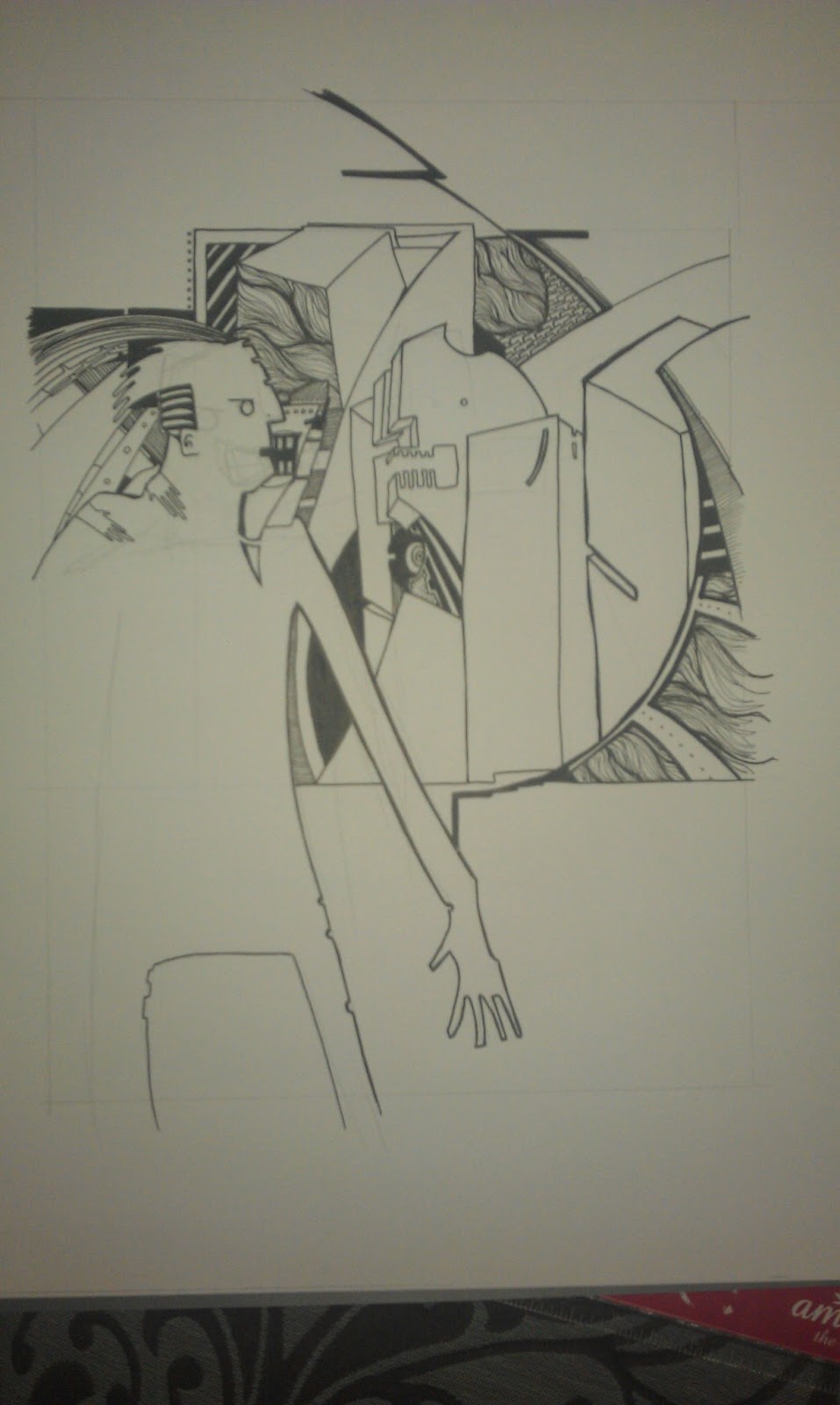
Here's some photos I just took -- I've done a lot of this work sitting on the benches in Smithfields Park, and that's where these photos were taken (hence the daylight and gravel).