Gareth A Hopkins
email: gareth@grthink.com

These pages will be kept updated with forthcoming gallery shows and news on completed artwork.

Pages from my ongoing surreal/abstracted comic 'The Intercorstal' can be found here: The Intercorstal

My deviantart gallery, chock-full of my art, can be found here: grthink

Stories from my (old) walk to and from work can be found here: Trolleys In Odd Places
Showing posts with label The Intercorstal. Show all posts

Wednesday, 9 September 2015

The Intercortal Dot Com

If you've not guessed from the title, The Intercorstal now has its own website: intercorstal.com

With 'After Smith' opening to the public in a couple of days time it seemed like a good time to give the project its own place, with room for it to grow, as well as to properly collect everything I've done so far.

You should have a look, it's alright.

Below are the two 'After Smith' comparison pages I've been sending out.

I'll tell you what, quietly: I'm really, really happy with how 'After Smith' has come out.


Thursday, 11 June 2015

Announcing - The Intercorstal: After Smith

On the left: Winwood and Cord in Killing Time (An Indigo Prime story) Part 5 Page 1. Art by Chris Weston, written by John Smith, Letters by Tom Frame
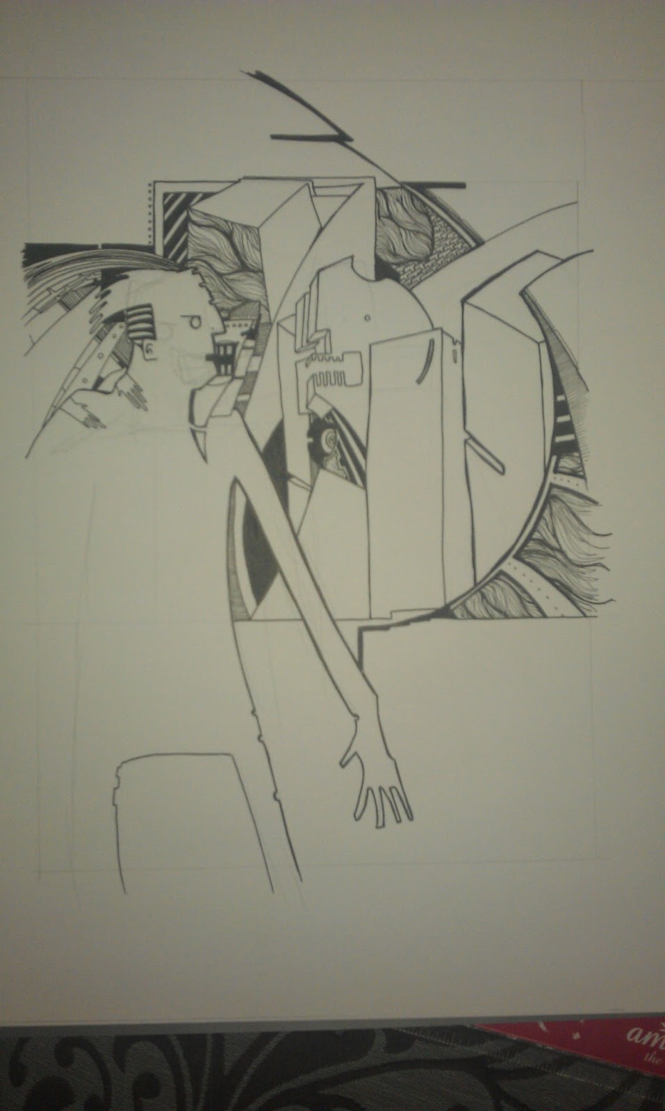
On the right: Prep page done for my reinterpretation.

"The Intercorstal: After Smith" is a series of artworks reinterpreting comic pages written by John Smith. It will be exhibited at Projectroom 404 in Bremen from 11th September - 4th October 2015.


A few months ago I was approached by Gregor Straub of Projectroom 404 in Bremen to participate in a series of exhibitions running this year that cover the Abstract Comics movement. Obviously, I agreed, and then set about worrying about what I'd exhibit.

With time to worry, I continued work on The Intercorstal 2, which naturally ended and turned into The Intercorstal 683 (which I'm still being a little coy about sharing). The last page of The Intercorstal 2 was a reinterpretation of a page from Revere, which ran in 2000AD in the 90s, and is one of my favourite comics of all time. On posting it, Tom Whiteley, who blogs at the superlative Suggested For Mature Readers, mentioned on Twitter how good it would be to reinterpret Revere in its entirety. I think he was only half-joking.

That thought merged over time with my thoughts of continuing the After Wainwright series that I started for the Lakes Comic Art Festival and then coalesced into paying tribute to one of the writers that has the most effect on my life - John Smith.

It's impossible to quantify the effect Smith's writing has had on me, both as an artist and person. I very much doubt The Intercorstal would have existed had it not been for his influence, although I hadn't actually realised when I started it. I joked recently that my entire 'swirly line style' is a subconcious attempt to recreate Winwood's hair as it appeared in Killing Time, which is probably more true than I'd like to admit.

So, 'After Smith'. I've selected 10 pages from his work for 2000AD based solely on how much I liked it and how much the series it appeared in had an effect on me. The selection also covers a number of my favourite artists, including Chris Weston, Sean Phillips, Edmund Bagwell, and Simon Harrison.

As prep, and so that I can be sure the whole idea's not going to fall apart, I've completed two half-size pages which I've included here, alongside the original pages I've worked from.

As the project continues, I'll be adding WIP images to Twitter (where I'm @grthink) and hopefully adding updates here where I'll try and go into more detail about why I've chosen particular pages/series and why I like them so much.

If you're around in Bremen during September, I hope you'll take a look.

Splundig Vur Thrigg.

On the left: Still Life Page 7. Art by Sean Phillips, written by John Smith,
On the right: Prep page done for my reinterpretation.


2000AD® JUDGE DREDD® AND ALL OTHER CHARACTERS ARE REGISTERED TRADEMARKS, © REBELLION A/S, ALL RIGHTS RESERVED

Thursday, 2 October 2014

'After Wainwright' for Lakes Comic Art Festival 2014

picture courtesy of Jonathan Petrie
Update 22/11/2014: Just a quick note on top of what's gone before (which is below) -- a competition was run on the Window Trai on a bunch of categories, and I was extremely humbled to win 'Best Professional Artist'. I'm still a little blown away by that, as well as all the great feedback I've had on these pages. I'm in the process of arranging prints right now.

Also, the pages are STILL on display, as part of Kendal Mountain Festival, at least until tomorrow (the 23rd November). So, yeah... Go Team G!
........................

I've been extremely fortunate in securing a spot on the Window Trail associated with this year's Lakes International Comic Art Festival, in Kendal. The festival itself runs from 17-19th October but the trail starts on the 3rd. My work's on display in the window of Petrie Design. (as pictured above)

The idea of doing reinterpretations of the work of A Wainwright came from Jonathan at Petrie Designs during our introductory emails. I'll admit to not being very familiar with Wainwright until that point, but a quick search on the internet made it clear what a great idea it would be.

For any others reading this who're unfamiliar with Wainwright, he was a fell walker who took it upon himself to record the Lakeland fells in the 7-volume Pictorial Guide To The Lakeland fells. The guides are an incredible achievement -- the entire collection was done by hand in his notebooks and reproduced directly from them. I'd recommend visiting the Wainwright society's website for further information, as they've got it down far better than I'll be able to.

The pages I've presented for the Trail are re-interpretations of three pages from The Pictorial Guides (Bowfell 16, Blencartha 26 and Grasmoor 16). The pages themselves are laid out very much like pages from a comicbook, although I'm not sure Wainwright had that in mind when he did them. Each of his pages represented different facets and views of the fell he was describing, exquisitely rendered in ink. I've approached them as I've done with comic pages I've reinterpreted for The Intercorstal, as well as using lessons learned from working on the mummy I did for Secret 7 and the birds I did as giveaways recently, where you take the contour and movement of a shape and redefine it, and twisting it at the same time. 

Scans of the pages are below -- if you are in Kendal for whatever reason, please take a look and let me know what you think.


Monday, 8 September 2014

Submission to Offlife 10

Click the picture for a version big enough to read the writing

I've been a fan of OFFLIFE for a while now, and have toyed with the idea of submitting something Intercorstal-ish for the past few open submission periods, although have usually backed down, pretty much convinced that I didn't stand a chance of getting in, down to the fact that The Intercorstal is like nothing they've run with before.

For their 10th issue I just went for it, though. I produced a brand new comic, which rips off its panel layout from a Ditko Amazing Spider-man page (which I have been reliably informed by Andrei Molotiu (here and here) that it's his best ever page).
What I instagrammed when I started on the page. Click the picture for the rest of my Instagram, which at the time of writing is very bird-heavy.

Knowing all along that the comic would be a longshot as it was, I decided that for the first time an Intercorstal page should have some text (I'd tried on previous pages to include text -- stuff about flapping listless and beacons dying and teeth teeth teetch, that sort of thing, but it never really worked). As Offlife is loosley based around subversions of real-life, I went with autobiog-comic style moaning, and chose the Internet as my target. I moan about the internet a lot, so it wasn't hard.

My attempts at lettering were WOEFUL and I said so on Twitter, at which point the extraordinary Jim Campbell offered to take a look and give me some advice, which I was bowled over by -- not least when he returned a completely lettered page, which he did, in his words, "in as close an approximation of Tom Frame's old school 2000AD lettering as I could manage." iceI'll be honest, I was amazed by how good it looked -- it had turned a page of swirly swirls into an 80s cosmic space battle. Even now I'm confused by how good it looks.

But long story short -- it didn't make it in. As you'll know if you've followed a link from Twitter or somewhere, because I'll have said so. But I knew it was a long shot, and I'm really looknig forward to reading the comics that did make the cut. And of course looknig forward to the next QuickDraw Live on the 18th, where I'll not have anywhere near enough time to do anything even remotely Intercorstal.

Friday, 23 May 2014

Dreddcorstal


While I was volunteering at London Super Comic Convention I started to think about putting a proper Intercorstal comic together -- a single issue, 30-odd pages, of pure Intercorstal comic work. And I realised that the Intercorstal, on its own, as proud as I am of it, would be a VERY hard sell to a mainstream comics crowd -- the sort of people who spend money at cons and shops.

Figuring I'd need to anchor The Intercorstal to the rest of the comics world with something, I fell on the idea of doing Intercorstal-style portraits of comics characters, and making a small book of them -- buoyed up significantly by how proud I was of the mummy I did for my Secret 7s entry.

Here's the first step toward that -- everyone's favourite fascist lawperson, Judge Dredd. I'm still not entirely happy with this -- I think it works in its own way, but really I'd like it to be more dynamic, which will probably involve finding a more dramatic angle and pose. I'll have another go once I've done some Crosby & Syd pages and had a punt at Batman. Here's some photos of how I went about the finished image, in case you're interested.

First pencil draft. Had a few books open as reference, in particular Henry Flint's work on Trifecta. Carlos Ezquerra is always a constant influence whenever I try to do Dredd, too. But I suppose that's the same for everyone.

Corrected pencil draft - shaved a bit off the helmet, tidied a few other bits up. Was also very unhappy that I'd gone with (what I consider) a rookie Dredd mistake, which is to hunch him all over, and you can see here where I drew his shoulders back in where a normal person's would be. That decision was also informed by Flint's drawing of him in particular Dredd strips, where he's in meetings with senior Judges and stands silently, statue-like.

Jumping ahead a bit -- I traced over the pencils onto A4 Bristol Board, losing all the work I'd done on the eagle but that's how it goes sometimes. At this stage I really wasn't feeling it, because the bits that haven't been filled in yet throw off the composition. Was working on faith that once the rest had been done it would look alright.

I'd worked some swirl into the helmst to stop it being too flat, and had been very careful not to overwork the mouth/chin bits. When I cam to fill the body, I was aware that just going in without a plan would make it look too layered and, again, flat, so broke it up into sections which (very) loosely described the abstract shapes that make up his chest.

Bit more filling.

Um, more filling.

Final furlong. Once I'd cracked these bits, added a little texture to the metals left over (eagle, shoulder pad, zipper) and scanned. Then bumped levels, paint-potted the line work to make it look fuller -- IRL the inks are enough, but even with the contrast bumped the inks look too thin and reedy after scanning) and did a few touch ups, and voila, the finished image that's up the top of the page there.


Tuesday, 26 November 2013

Intercorstal VS Still Life

Working on The Intercorstal can be difficult. There's a need to constantly re-invent or reuse, and although certain elements and patterns crop up often, there's no set way to go about the creation of the comic, and it always feels like I'm making it up as I go along. It's a tiring process, and with the obscurity the comic exists in, it's not often as rewarding as I'd like.

To help me along, I hit upon the idea of re-purposing pages and layouts from the narrative comics that I love, and it's an approach that's worked pretty well so far. To this date, I've stolen layouts from Kevin O'Neill's 'The League Of Extraordinary Gentlemen', Sean Phillips and Duncan Fegredo's work in 'New Statesmen', Will Simpson's 'Tyranny Rex', Chris Weston in 'Indigo Prime: Killing Time' and Sean Phillips again with two pages from 'Still Life' (those paying attention, and in the right know, will notice that a lot of those comics were written by John Smith for 2000AD, and that's not really surprising knowing my tastes, although it actually wasn't intentional).

The amount actually 'stolen' from each of those artists is debatable, I guess. Mostly it's just layouts. I doubt that unless I pointed it out every now and again anybody would be any the wiser. But it's interesting, and I felt like sharing. In particular, I wanted to show off a particular page, for a few reasons:

1. It's an accidental collaboration with my 4yr old son. I love making stuff with him - he's not got any kind of patience for completing an image, but he does have the best ideas. For instance who else would suggest a Fiat 500, Lego Mr Freeze and C3-PO as decorations for the birthday card of an 82yr old granny?

2. I wanted to draw some attention to the comic it's worked from. I wasn't really aware of 'Still Life' by John Smith and Sean Phillips -- it was in the Revolver Romance Special in 1990, when I was 10, so it passed me by when it first came out) (Revolver being a short-lived 'mature' offshoot from 2000AD). I only found out about it from Tom Whiteley's superior blog "Suggested For Mature Readers" where he wrote a perfect review of it, and also made it available for download. It ruined me when I first read it, and continues to haunt me now, months later.

3. I wanted to show off a bit of process again, for my own gratification. And I also wanted to maybe highlight this particular page, because I think what's great about it might get lost with only casual observation.

So, here's the page I bit from, by Sean Phillips:
It's an intensely, and genuinely, intimate page, which is so rare in any media, let alone comics. So I felt that if I was stealing and re-purposing pages, this is one I had to use. I started by sketching out the rough shapes, getting the perspective approximately right, giving the right feeling of weight. And then... well, then I got scared. It felt like too much to take on, and I left it to one side while I worked on other stuff.

And then Bill came along while I was drawing, and wanted to help. I balked at him 'helping' on any pages I'd already started inking, so let him at my pencils of this, and he attacked the page, ruining one of my pens and leaving this behind: (this scan was taken after I'd already started working back on it - you can see where I started by working into the edges of the bath):
And then I liked it enough that I started working further and further into it, until finally I had this:
Which I then did this to, getting the final image:
And...yeah, that's it. But hopefully it's clear now (why I feel it needs to be clear, I don't know) why I'm working in the way I am. The latest page I've started is based on one of the classic Ditko Spider-Man pages, although whether anyone will know by the time I'm done with it... well, I guess that'll be up to whether they've read this, I suppose.

Monday, 25 November 2013

The things that are happening now

1. I collaborated with a bunch of people to come up with a non-narrative graphic novel. It's called 'A Kick In The Eye', it's available from Amazon, and best of all it's CHEAP. You should get a copy, like, NOW. http://www.amazon.co.uk/kick-In-The-Eye-Collaborative/dp/1492970107/ref=sr_1_1?ie=UTF8&qid=1385386496&sr=8-1&keywords=a+kick+in+the+eye+a+collaborative+graphic+novel

Here's a scan of two of the pages I did, in their original colour (always intended to greyscale out for the finished book):
2. I'm mostly working on The Intercorstal, in a second phase. I'm up to Page 11 now, and am genuinely excited by it so far. Sharing on the internet has been random and sporadic -- sometimes just a crop via Instagram, sometimes the scanned page, sometimes the finished article. Here's some of it:


3. Um, I actually think that's it.

Thursday, 10 January 2013

The Intercorstal and P&O


I've just cut up a P&O Cruises brochure to get images as a starting point for another Intercorstal project, which I'll do either as the Mr Soft project finishes, or in tandem with it. This new project will be the fourth Intercorstal-related thing I've done which heavily uses P&O promotional material, having already completed:

Witches which was based on a set of 8 promotional postcards
Valentine, based on a brochure
Mr Soft, which uses cut up pages from a P&O brochure to make comics on two of the project's four final pages.

P&O isn't the only company that I've taken promotional images from as a basis to make comics -- Collider used pages from an IKEA catalogue and Butcher's Park was made from an Epic Learning brochure. Oh, and I have a sketchbook made from a Next catalogue. But why do I use these images, and why do I return to P&O so often?

I spend a fair amount of time thinking about this, although precious few people have actually ever asked me. Here's some reasons that I've come up with:

1. The Intercorstal as a project is mostly monotone, and at some point I decided that it needed some colour. I experimented with including colour in the 'traditional' pages, but was never really happy with it. The only 'released' example I can think of is "Taking Advice From Bryan Lee O'Malley" which I did for the second TwitterArtExhibit. So a way to introduce colour is to have it there already, and base the ink work on those. And I think generally it works really well, which is why I keep coming back to it.

2. Those source images are so beautiful in their own right, it seems a shame that they are so easily passed over and dismissed. They're used by the companies involved to inspire particular emotion in order to sell their product -- most people when reading these materials don't pay a great deal of attention to the pictures. Reusing them is my way of appreciating them, making them exist as objects of beauty, rather than just tools to sell cruises/furniture/etc.

3. Nobody does blue sky like P&O. That yawning expanse of pure blue is one of their biggest selling tools -- a place of opportunity, peace, hope, that people can buy into by going on one of their cruises. And it's a great tool to use when you're looking for colour to compliment and act as counterpoint to something like The Intercorstal, which is dense, complicated and often quite violent.

There's probably a hidden psychological aspect, too -- as there is with so much of my work. I mean, I've been on a couple of P&O (one of which I've blogged about here) cruises, and my wife and her family totally love them, but whether there's an emotional reason that I keep returning to them in my art, and responding to their image in the way that I do, is probably best left to a professional to decide.

Friday, 4 January 2013

Oh, hello 2013

A new year brings with it a new set of promises to myself that I'll blog more. And maybe even update my website. But we'll start with the blogging and move on from there.

I've already started on one front, having posted two blogs to the Abstract Comics blog -- one about Collider and one about a pair of Intercorstal strips I did. 

But I feel kind of disingenuous there, because they both cover old work that I'd forgotten about and come back to, which would normally be the recourse of someone with no new work in the pipeline. Which is, thankfully, totally not the case.

I'm currently working on four images based on the character Mr Soft from the comic New Statesmen by John Smith, Jim Baikie, Sean Phillips and Duncan Fegredo. Getting people excited about this is pretty difficult, as the comic was around in the late 80's/early 90's and nobody really remembers it with any clarity, and Mr Soft wasn't even an actual character in the comic. So my first task, which I endeavor to complete in the next few days, is to put up a post about Mr Soft and The New Statesmen. If you feel particularly eager, I strongly suggest you read these recent reviews of The New Statesmen on the exemplary Suggested For Mature Readers blog:


In the meantime, have a peep at these WIP photos -- the process of making the pictures is being pretty robustly detailed through Instagram at the moment.

Cutting up a picture done on stickers prior to application elsewhere for No4.

Early work on No1.

About halfway through No2, although this image might still be scrapped.

Early work on No3, where pages from a P&O brochure were chopped into comic panels. Excuse the holey sock and toes on show.

Thursday, 30 August 2012

The Intercorstal: Butcher's Park

I've finished the sixth installment of The Intercorstal -- here's a video of it while I get a PDF sorted.

I've also posted to the Abstract Comics blog, where I've been characteristically modest about it, but I think it's some of the best work I've done in ages.

Tuesday, 15 May 2012

Batman Ghosts


I'm taking part in the very exciting HEADS UP group show in Chelmsford, organised by The Shiny Shed Collective, which takes place between 19th and 27th May. I'll be using the space I have as an excuse to show off The Intercorstal in a gallery context, as opposed to the short comics and zines which have been done so far. I'll also be unveiling my first 3D piece, which is a kind of semi-installation, which I'll go into more detail when the show starts.

Batman and Robin Ghosts
On sale there will be a collection of postcards of Batman Ghosts. Essentially, they're the Ghosts that I've been including in my work for years now, but with Batman's ears built in. In some of the scenes, I play up to the Batman side, in others I don't. No two are the same and I hope to have at least 50 done by the launch of the show. I've given up on the idea that I'll have scanned them all beforehand, so here's some photos of a few of them.
Vampire Batman Ghost
Unicorn Batman Ghost
Lots of Batman Ghosts

Tuesday, 13 March 2012

Twitter Art Exhibit 2012

Here's my submission to the 2nd Twitter Art Exhibition, being held in Moss, Norway, in April 2012. It's being organised by David Sandum, with all money from sales of artwork going to The Women's Crisis Center in Moss. Full details of the submission and event can be found HERE: http://davidsandumart.posterous.com/call-for-artists-2nd-twitter-art-exhibit-in-m

There wasn't any particular theme, but I thought it'd be cool to work on some advice that Bryan Lee O'Malley (creator of Scott Pilgrim) posted on his twitter feed:

I'm past knowing whether I followed that advice or not, but I was thinking about it while I worked on the page. Once I've had a chance to think about it a bit I might be able to make some sense of it in the context of my other comics work. As it stands, though, I'm pretty happy with how it turned out, and regular readers of this blog will know how terrifyingly rare it is for that to happen.


Tuesday, 15 November 2011

On Page 51. Some process.

I've just posted Page 51 to The Intercorstal blog. It's very chicken based, and that's only really half on purpose.
I was flicking through the sketchbook I'm currently using for pages of The Intercorstal and found some sketches I did of the Stepney City Farm's animals as prep for the Paul Foot Jigsaw Madness flyer a few months ago. There was a page with three sketchy chicken heads on there, all faulty in one way or another (the drawings were faulty, not the chickens) and I thought it would be interesting to use my own sketches as a base for a page, considering I've used so much else recently (P&O brochures and postcards in particular). This is what it look like to start with:

Then I drew a grid over the top of it and set to work. When I was working on the grid I used some smaller, square frames having been really impressed with the layouts in P. Craig Russel's adaptation of The Sandman: Dream Hunters which anxietydescending got me as an early Christmas present. It's pages like this one, courtesy of Comic Book Resources, that I was thinking of:
http://www.comicbookresources.com/news/preview2.php?image=previews/dccomics/vertigo/dreamhunters/SNDDH-2.24.proof.jpg
And then, yeah, I laid into it. Normally I'd work on The Intercorstal while watching TV or a film, but since moving house I've now got a desk to work at, which is much more comfortable, but there's no TV. As background I put on Alan Moore's reading of Unearthing which helped a lot, but there came points when I naturally needed to take breaks to free up some ideas. These ideas came from stuff I had lying around, and their influence is much clearer in this page than in others (which is why I thought it might be interesting).

 
Here's a run through of what's in there, other than the chickens, that didn't come directly out of my brain:

Top-right panel: There's an eye-shape near the inner border which I took from a Sandman toy that Anxietydecending bought me a while ago.
Centre-left: In the top-left corner of the frame there's a hand holding a box (you can only see the bottom of the box) which I copied from a photo I had of a Communist Chinese statue of a worker -- the dimensions are true to the sculpture.
Bottom-left: A set of lips copied from a photo of a Chinese statue of Marilyn Monroe.
Middle two on the bottom row: Details from the aforementioned Sandman toy.
Bottow row, right-hand side: A line drawing based on a photo of the view through my mum's patio windows. This was the last frame I completed, and I thought the relative simplicity made a nice contrast to the rest of the page while still being full of Intercorstally shapes.

This is the first time I've gone into this much detail of my process on an Intercorstal page -- if you've got this far I'd appreciate any feedback on whether this is something you'd like to see more of? There are still patterns and shapes and characters in this page that I could wang on about, as there are in all the Intercorstal pages, so if there's any interest whatsoever I'll try it again for Page 52.

Sunday, 19 December 2010

Intercorstal On Show


It feels like a long time ago now, but on December 7th 2010 (it's the 20th as I write this) I got a chance to show off some of the work I've done on The Intercorstal in a new way -- rather than in a comic, it was hanging on banners.

It came about because my new department at work held a gig/DJ night for... well, nobody's really sure how it came about. But somehow it was decided that a gig/DJ night would be put on, and they arranged The Distillers bar to hold it in. And then the ringleader of effort said 'Gareth, you can display some of your art on the windows, it'll look good!' despite not really knowing what I've been working on.

Through a desperate creativve process which involved... again, I can't really remember how I got to where I did. But I decided that I'd hang pages from The Intercorstal on banners from the balconies in the pub. I won't go into the full banner-making process but at 5pm on the day, with doors open at 7pm, I started frantically combining lining paper, blown up Intercorstal pages and plastic dowling rods with staples. The plan was to make eight banners, which after an hour and a half was reduced to six, and after another half an hour reduced to four. At about 7-ish, with me very hot and bothered, receiving desperate looks from the head waitress because I was spread out across some of her dining area, myself and a colleague managed to get the banners hung.

Feedback on the night was surprisingly positive, although limited as barely anyone turned up...and everything was packed up at 9:30, so it took longer to set the display up than it was on show for. The bar staff were kind enough to take the banners off my hands at the end of the night, but that might be because the evening's compere told the assembled crowd that my work sold for great amounts of money (my work doesn't sell, let alone for a lot of money).

Having said that, I'm proud of what I managed to acheive with such limited resources -- total setup costs were £5 -- and know that if given the opportunity again, that I could replicate it. Apologies for the quality of the images, it was dark and I only had my phone on me.

Thursday, 11 November 2010

The Intercorstal: Collider

A little while ago I compiled the first 32 pages of The Intercorstal as a standalone comic and gave away copies. One of those went to an amazing artist in The Netherlands called Ibrahim Ineke at the Baracca gallery, who a few months later he emailed me inviting to contribute to an exhibition that he was helping arrange -- I'll post more about that as and when it happens.

But for the exhibition, I was asked to come up with a new comic, and after a little experimentation and playing with some ideas, I've created The Intercorstal: Collider. It's a slender little 12-page wonder, combining six previously unpublished pages of The Intercorstal with six brand-new, unique pages, which I'm not going to explain because it would ruin them.

The whole thing was skillfully and professionally packaged for print by the ever-amazing anxietydecending, who I genuinely can't thank enough.

And, as before, I'm giving away copies to anyone who wants one, and probably also to people who don't. So, if you want one, email me at gareth@grthink.com with a postal address and I will get one in the post to you! (If you received a copy of The Intercorstal, don't assume I've still got your address, as I'm wildly disorganised)

Here's a couple of photos of this work of wonder to whet your wappetite.