Gareth A Hopkins
email: gareth@grthink.com

These pages will be kept updated with forthcoming gallery shows and news on completed artwork.

Pages from my ongoing surreal/abstracted comic 'The Intercorstal' can be found here: The Intercorstal

My deviantart gallery, chock-full of my art, can be found here: grthink

Stories from my (old) walk to and from work can be found here: Trolleys In Odd Places
Showing posts with label Mr Soft. Show all posts

Monday, 24 June 2013

Mr Soft

A little while ago I was posting WIP's and other information about some illustrations I'd done of the character Mr Soft... well, here they are. The zine they were done for didn't get printed for the same reasons many of these things don't and there's no hard feelings.

I've posted the final black&white versions, with some info about Mr Soft himself at the Abstract Comics blog: http://abstractcomics.blogspot.co.uk/2013/06/mr-soft.html

And I've posted the cropped colour versions to my Facebook page: https://www.facebook.com/media/set/?set=a.502982049774027.1073741831.203955136343388&type=1

SO to keep things interesting, what I'm posting here are the rough, untouched scans, which have their own charm. They were made on A3 paper, if that helps make sense of them at all.


Friday, 11 January 2013

Mr Soft Page X

'Mr Soft Page X' which used to be 'Mr Soft Page 1' until  I replaced it with something different.
The Mr Soft project I've posted about recently is finished. I've completed the images, scanned and cropped them and they're ready to be sent off. Once they appear in print I'll post details of where that is (France, mostly, for those wondering).

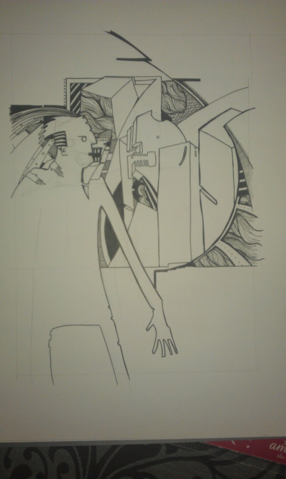
Here's the first image I started as part of the project. It's quite a literal illustration of one of the sections in the novel Mr Soft appears in, 'And He The Mother Of Them All'. In this scene, Mr Soft stands and watches the explosion of a bomb he's planted on the other side of the city from the safety of a hotel room. He watches a cloud of toxic gas rise from the explosion, and works out that he's got enough time before the cloud reaches him to... well, he calls hotel reception and gets them to send up a prostitute, as he gets 'the scalpels' from his zebra skin suitcase.

I grew unhappy with this image as I was working on it. I couldn't make Mr Soft ambiguously shaped and really nasty and looking out of a window all at the same time, so this was dumped and replaced with an image made of cut up catalogs, postage stickers and some ink.

Until the images are published, I won't share them -- I've posted enough details and WIP's on Instagram to give an idea of what I've done, so if you're interested search for the hashtag #mrsoft.

Thursday, 10 January 2013

The Intercorstal and P&O


I've just cut up a P&O Cruises brochure to get images as a starting point for another Intercorstal project, which I'll do either as the Mr Soft project finishes, or in tandem with it. This new project will be the fourth Intercorstal-related thing I've done which heavily uses P&O promotional material, having already completed:

Witches which was based on a set of 8 promotional postcards
Valentine, based on a brochure
Mr Soft, which uses cut up pages from a P&O brochure to make comics on two of the project's four final pages.

P&O isn't the only company that I've taken promotional images from as a basis to make comics -- Collider used pages from an IKEA catalogue and Butcher's Park was made from an Epic Learning brochure. Oh, and I have a sketchbook made from a Next catalogue. But why do I use these images, and why do I return to P&O so often?

I spend a fair amount of time thinking about this, although precious few people have actually ever asked me. Here's some reasons that I've come up with:

1. The Intercorstal as a project is mostly monotone, and at some point I decided that it needed some colour. I experimented with including colour in the 'traditional' pages, but was never really happy with it. The only 'released' example I can think of is "Taking Advice From Bryan Lee O'Malley" which I did for the second TwitterArtExhibit. So a way to introduce colour is to have it there already, and base the ink work on those. And I think generally it works really well, which is why I keep coming back to it.

2. Those source images are so beautiful in their own right, it seems a shame that they are so easily passed over and dismissed. They're used by the companies involved to inspire particular emotion in order to sell their product -- most people when reading these materials don't pay a great deal of attention to the pictures. Reusing them is my way of appreciating them, making them exist as objects of beauty, rather than just tools to sell cruises/furniture/etc.

3. Nobody does blue sky like P&O. That yawning expanse of pure blue is one of their biggest selling tools -- a place of opportunity, peace, hope, that people can buy into by going on one of their cruises. And it's a great tool to use when you're looking for colour to compliment and act as counterpoint to something like The Intercorstal, which is dense, complicated and often quite violent.

There's probably a hidden psychological aspect, too -- as there is with so much of my work. I mean, I've been on a couple of P&O (one of which I've blogged about here) cruises, and my wife and her family totally love them, but whether there's an emotional reason that I keep returning to them in my art, and responding to their image in the way that I do, is probably best left to a professional to decide.
Wednesday, 9 January 2013

Describing Mr Soft. 2nd Attempt.

Languishing in my draft posts is my attempt to describe why I've been creating interprative illustrations of Mr Soft. I doubt I'll be publishing it. Instead, here's some source material, taken from "The Complete New Statesmen", written by John Smith. The photo is an illustration by Brendan McCarthy, which I've taken as my cue for my project.

Excerpt from "The Pre-Pubertal Man", taken from "And He The Mother Of Them All".

    Lonnie waved up at Mr Soft with a tiny hand, shiny with amniotic fluid, and gestured for him to sit down.
    "So," Lonnie said, "what can I do for you?"
    "I want a disease, Lonnie. A Kurtzeimer retro."
    "You aren't thinking of hitting Harlem again, are you?"
    Mr Soft shrugged, and scribbled a skull-and-crossbones in the air with the tip of his crook. Lonnie laughed, the speech module turned it inot a funny rattling sound, like gravel in a tin can.
    The laughing must have been uncomfortable for the woman, though, because she moved in her sleep, moaning softly."

Friday, 4 January 2013

Oh, hello 2013

A new year brings with it a new set of promises to myself that I'll blog more. And maybe even update my website. But we'll start with the blogging and move on from there.

I've already started on one front, having posted two blogs to the Abstract Comics blog -- one about Collider and one about a pair of Intercorstal strips I did. 

But I feel kind of disingenuous there, because they both cover old work that I'd forgotten about and come back to, which would normally be the recourse of someone with no new work in the pipeline. Which is, thankfully, totally not the case.

I'm currently working on four images based on the character Mr Soft from the comic New Statesmen by John Smith, Jim Baikie, Sean Phillips and Duncan Fegredo. Getting people excited about this is pretty difficult, as the comic was around in the late 80's/early 90's and nobody really remembers it with any clarity, and Mr Soft wasn't even an actual character in the comic. So my first task, which I endeavor to complete in the next few days, is to put up a post about Mr Soft and The New Statesmen. If you feel particularly eager, I strongly suggest you read these recent reviews of The New Statesmen on the exemplary Suggested For Mature Readers blog:


In the meantime, have a peep at these WIP photos -- the process of making the pictures is being pretty robustly detailed through Instagram at the moment.

Cutting up a picture done on stickers prior to application elsewhere for No4.

Early work on No1.

About halfway through No2, although this image might still be scrapped.

Early work on No3, where pages from a P&O brochure were chopped into comic panels. Excuse the holey sock and toes on show.