Gareth A Hopkins
email: gareth@grthink.com

These pages will be kept updated with forthcoming gallery shows and news on completed artwork.

Pages from my ongoing surreal/abstracted comic 'The Intercorstal' can be found here: The Intercorstal

My deviantart gallery, chock-full of my art, can be found here: grthink

Stories from my (old) walk to and from work can be found here: Trolleys In Odd Places

Tuesday 26 November 2013

Intercorstal VS Still Life

Working on The Intercorstal can be difficult. There's a need to constantly re-invent or reuse, and although certain elements and patterns crop up often, there's no set way to go about the creation of the comic, and it always feels like I'm making it up as I go along. It's a tiring process, and with the obscurity the comic exists in, it's not often as rewarding as I'd like.

To help me along, I hit upon the idea of re-purposing pages and layouts from the narrative comics that I love, and it's an approach that's worked pretty well so far. To this date, I've stolen layouts from Kevin O'Neill's 'The League Of Extraordinary Gentlemen', Sean Phillips and Duncan Fegredo's work in 'New Statesmen', Will Simpson's 'Tyranny Rex', Chris Weston in 'Indigo Prime: Killing Time' and Sean Phillips again with two pages from 'Still Life' (those paying attention, and in the right know, will notice that a lot of those comics were written by John Smith for 2000AD, and that's not really surprising knowing my tastes, although it actually wasn't intentional).

The amount actually 'stolen' from each of those artists is debatable, I guess. Mostly it's just layouts. I doubt that unless I pointed it out every now and again anybody would be any the wiser. But it's interesting, and I felt like sharing. In particular, I wanted to show off a particular page, for a few reasons:

1. It's an accidental collaboration with my 4yr old son. I love making stuff with him - he's not got any kind of patience for completing an image, but he does have the best ideas. For instance who else would suggest a Fiat 500, Lego Mr Freeze and C3-PO as decorations for the birthday card of an 82yr old granny?

2. I wanted to draw some attention to the comic it's worked from. I wasn't really aware of 'Still Life' by John Smith and Sean Phillips -- it was in the Revolver Romance Special in 1990, when I was 10, so it passed me by when it first came out) (Revolver being a short-lived 'mature' offshoot from 2000AD). I only found out about it from Tom Whiteley's superior blog "Suggested For Mature Readers" where he wrote a perfect review of it, and also made it available for download. It ruined me when I first read it, and continues to haunt me now, months later.

3. I wanted to show off a bit of process again, for my own gratification. And I also wanted to maybe highlight this particular page, because I think what's great about it might get lost with only casual observation.

So, here's the page I bit from, by Sean Phillips:
It's an intensely, and genuinely, intimate page, which is so rare in any media, let alone comics. So I felt that if I was stealing and re-purposing pages, this is one I had to use. I started by sketching out the rough shapes, getting the perspective approximately right, giving the right feeling of weight. And then... well, then I got scared. It felt like too much to take on, and I left it to one side while I worked on other stuff.

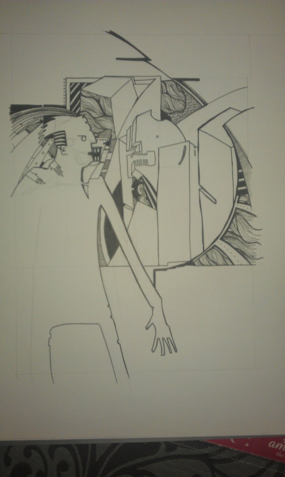
And then Bill came along while I was drawing, and wanted to help. I balked at him 'helping' on any pages I'd already started inking, so let him at my pencils of this, and he attacked the page, ruining one of my pens and leaving this behind: (this scan was taken after I'd already started working back on it - you can see where I started by working into the edges of the bath):
And then I liked it enough that I started working further and further into it, until finally I had this:
Which I then did this to, getting the final image:
And...yeah, that's it. But hopefully it's clear now (why I feel it needs to be clear, I don't know) why I'm working in the way I am. The latest page I've started is based on one of the classic Ditko Spider-Man pages, although whether anyone will know by the time I'm done with it... well, I guess that'll be up to whether they've read this, I suppose.


Monday 25 November 2013

The things that are happening now

1. I collaborated with a bunch of people to come up with a non-narrative graphic novel. It's called 'A Kick In The Eye', it's available from Amazon, and best of all it's CHEAP. You should get a copy, like, NOW. http://www.amazon.co.uk/kick-In-The-Eye-Collaborative/dp/1492970107/ref=sr_1_1?ie=UTF8&qid=1385386496&sr=8-1&keywords=a+kick+in+the+eye+a+collaborative+graphic+novel

Here's a scan of two of the pages I did, in their original colour (always intended to greyscale out for the finished book):
2. I'm mostly working on The Intercorstal, in a second phase. I'm up to Page 11 now, and am genuinely excited by it so far. Sharing on the internet has been random and sporadic -- sometimes just a crop via Instagram, sometimes the scanned page, sometimes the finished article. Here's some of it:


3. Um, I actually think that's it.

Friday 13 September 2013

Ravens And Chimes

Recently did an illustration of the band Ravens and Chimes for Amelia's Magazine. Here's the process:

Draw the band from a promo photo on their website
Draw some ravens in flight, using Google Images as a source.

In Photoshop, create a background by rotating and pasting the ravens image, and add the band drawing in the foreground.

Print out the combined image and paint the background. Printer ink mixes with the watercolour and makes unexpected hues and shadows.


Crop the image, bump contrasts and levels: Final image.

Monday 24 June 2013

Mr Soft

A little while ago I was posting WIP's and other information about some illustrations I'd done of the character Mr Soft... well, here they are. The zine they were done for didn't get printed for the same reasons many of these things don't and there's no hard feelings.

I've posted the final black&white versions, with some info about Mr Soft himself at the Abstract Comics blog: http://abstractcomics.blogspot.co.uk/2013/06/mr-soft.html

And I've posted the cropped colour versions to my Facebook page: https://www.facebook.com/media/set/?set=a.502982049774027.1073741831.203955136343388&type=1

SO to keep things interesting, what I'm posting here are the rough, untouched scans, which have their own charm. They were made on A3 paper, if that helps make sense of them at all.


Monday 10 June 2013

A post about how much I love Anticon, prompted by the Wandering Wolf

Nowadays, with two children to feed, and two cars to drive them around in, and a house I pay for them (and me, and my wife) to sleep in, finding money to spend on music pretty much never happens. But back in the day, when I was working on the Deli at Tesco, and my girlfriend (now wife) was off at uni, I spent a LOT of money on music.

And a large proportion went to Anticon. I'd never have found out about them, bizarrely, if I hadn't been looking for post-hardcore records online -- I was obsessed with Rival Schools' "United Against Fate", and looking for other stuff by them took me to Some Records, which is where I fell in love with The Ghost, and looking for more like The Ghost took me to Southern Records (who did distribution for Some, back in the day). Southern were handling distribution for a whole bunch of really interesting record labels, including Anticon, and had a great website littered with free samples from bands I'd never heard of, and probably would never have heard of otherwise. At the time, as I said, I was after rock music, and one of the artists was 'Different' by 'Sage Francis'. In a shocking bout of naievity I thought maybe it would be like Frank Black (aka Black Francis) so I did the ol's Right-Click-Save-As and as it was 2003 left the download going overnight.

Sage Francis is a rapper, as I found out the next morning. And I instantly fell in love with 'Different' so I bought 'Personal Journals' and was blown away by it. So then I started scrabbling around for anything similar, and since it was released on Anticon and I had some spare money (I was living with my mum, so all my money was spare) I bought a whole bunch of stuff that was out then -- Selling Live Water, Bottle Of Humans, Oaklandazulasylum, Music For The Advancement of HipHop, Forcefield Kids -- I was just eating it all up. And obviously that spilled out to records by Anticon artists on other labels, like Boom Bip and Doseone's Circle.

I was, frankly, obsessed, and stayed that way for a good few years, even now to some extent with most of the energy I'd use on obsession burned up through fatherhood, chomping up everything they released. I used to check the website twice a day in case there was any news (they usually updated about every two weeks...) I was on the Restiboard, and when that closed jumped over to Sole's board for a long time. I dragged my wife to the 'Live From Rome' release party and my two best friends to see Passage (hungover) at the Spitz. (Actually, over the years, I've dragged my friends and/or wife to a lot of hiphop gigs they weren't really keen on.)

Here's an illustration I did of Doseone and Andy Broder, as CrookandFlail, as part of the review I did of the Unearthing live shows for Amelia's Magazine.

Those artists are still top of my agenda, when I do have money to pay for music or (heaven forfend) going to gigs. Subtle will probably always be my favourite band, I'm still trying to keep up with sole intellectually and ideologically, I'm still waiting for Unindian Song Vol2.

Recently, Yoni Wolf (I'm not sure if he still uses the pseudonym why? or if that's just the name of his band now) has been releasing podcasts with various artists, and the two featuring Adam Drucker (Doseone) are just... Well, they're great. But it's a weird experience for me, because suddenly all the information I was so hungry for about Anticon 10 years ago is just THERE, and it's great. Trouble is, now I want MORE. I want extra from Dose and Jel and Yoni and I want to hear from Passage and Telephone Jim Jesus and Sole and all those guys with superb, ridiculous names.

This is the latest one, which also has Jel covering (some of) his own personal history. I'm really hoping there are more soon.

Sunday 17 March 2013

#animalchallenge

After the Jackal and Magpie images I did for Secret7s I was eager to do more pictures of animals, but didn't want to spend hours browsing Google Images until I found one. Instead, I asked Twitter what I should do -- first answer back was 'A Liger' by Anxiety Decending and after 5 mins of Google (including double-checking that Ligers aren't bred for their skills and magic) came up with this:
A Liger
And since then (starting Friday lunchtime, writing now on Sunday night) I've done another 7 animals, including a Degu, a rat, a monkey, a turtle, a hippopotamus and an elephant.

I'm really enjoying it -- it's nice to have a change from the purely abstract, which is what I've been working on recently -- making cutups for 'the secret project'. It's like I needed to prove to myself that I could draw figuratively if I needed to, and a few of the images I've done so far have suggested I can. I'm planning to work a couple of these up to fit in with the Secret7" stuff I did, too.

As well as adding them as I go on Instagram and Twitter, I've started a dedicated gallery on my Facebook artist page -- feel free to like the page while you're there, y'know. If you want to.

Tuesday 19 February 2013

Secret7"

I missed out on Secret7" last year, somehow, and this year decided in a pretty off-hand way that I'd submit something. So I had a listen to the tracks to work from, and instantly fell in love with Laura Marling's "The Beast". As I was listening to it, I knew I had to include a Jackal somewhere, and after doodling a few ideas, the design for my final  sumbisssion came pretty much fully formed into my head. After that it was just a case of finishing it off and here it is. If you'd like to VOTE FOR IT then you can click the link in the caption, below.
http://www.talenthouse.com/creativeinvites/preview/grthink/888
While I was working on "The Beast" I felt the urge to do another. Again, the design for an image came fully loaded into my head, but unfortunately for me, the image was of a hand, for Jessie Ware's "Still Love Me" and drawing hands is my artistic Kryptonite. As I was sketching my hand, over and over and over, I realised that I needed to break off and work on something else, and as I listened to Haim's "Better Off" I came up with the image of a bird. Because of my personal fixation with Magpies, doing one of those seemed like a natural choice, and I came up with this:
CLICK HERE TO VOTE FOR THIS IMAGE
And once I'd finished the Magpie off, I re-approached the hand image. 

Now then, I happen to think this last image is the best of the three. I probably shouldn't play favourites, but conceptually I think it's the strongest: is the wedding ring missing -- and if it is, is there still love in that relationship? Plus, it's got the best balance of shape and movement, and a big block of my favourite colour... I think you should vote for that too, if you're reading this.

CLICK HERE TO VOTE!
If you do vote, then thanks -- I really appreciate it.

If you don't, I'll know, and I'll hunt you down*

*really
(not really)

Also, the voting system doesn't really affect the choice for most of the entries, so it's a kind of nice to have, not an imperative. Cheers.

Tuesday 29 January 2013

Wolfman's Got Nards

While I had breakfast this morning, I watched the end of The Monster Squad, which was on Sky Movies. It's a film that I used to watch a LOT as a child, back when I lived in Aberaeron (my brother bought his copy on VHS from Aberystwyth's WHSmith) and watching it back now, while it's obviously dated, it's still as good as I remember.

What it also reminded me of was that a while ago -- a year, year-and-a-half, maybe -- I made these two illustrations of an iconic scene from the film for a zine project. But yeah, here I am, finally sharing the pictures I did. As well as the differences in colour between the two, there's also the change in order of the first two panels. Don't know which one I prefer, if I'm honest.


Monday 28 January 2013

"So, how's things going, with your art?"

I'm often asked how things are going, what I'm working on, etc. Becasue of any number of reasons, I'm quite reticent to share -- occasionally, I can't remember what I'm actually working on because I'm thinking about what I'd rather be working on, for instance. Or I get flustered trying to explain I'm making an abstract comic by drawing on packing labels that I've stuck to pages that I've rescued out of the recycling at work.

So, here's a quick list of what I'm working on, want to work on and should be working on (as much to help me remember as anything else):

Resyk: This is that abstract comic based on pages nicked out of the recycling at work I mentioned above. The pages were double-sided but there was only three of them, so that's 6 finished pages of work. The first two pages are included at the top of this blog. Trivia: The word 'Resyk' is nicked from Judge Dredd, and is the name for the facility in Mega City 1 where dead bodies are sent to retrieve important natural resources like water and carbon.

Vineland: Last year I managed to come into possession of two tattered 1st edition copies of Thomas Pynchon's Vineland (one of my favourite novels). I've just started making inroads into 'working it up' by drawing on each page, inspired by Tom Phillips' "A Humument". So far I've done testers on the blank pages at the back, but soon hope to start on in full.

The Intercorstal: Elipses: I've been promising this for a year and a half now -- a collected retrospective of everything I've done related to The Intercorstal. I've rescanned all the pages, and ow have to go through the arduous task of formatting them all so they print at least consistently. I'll get it done eventually.

The Intercorstal: Ladythings: A long while ago I won some ephemera from the artist Kye Sanga that I promised to turn into a comic. This included a cheap, torrid little romance book, some Piano tuition books, some beads and a few polaroids of total strangers. I've not made a start, as frankly I've got no idea how to start, but will get there eventually.

The Intercorstal: I still need to do some more 'traditional' Intercorstal pages, to keep that side of the whole project moving. I'm too easily distracted by the lure of detournement of exiting images, though.

Secret 7: At Faye West's suggestion I'm going to give this year's Secret 7 a go. No idea which artist to illustrate for, or whether to do more than one, or whether I'll have time to even get one done.

Mr Soft:  Waiting for the final images to be published, but all the works been done and I'm really proud of what I produced. I've blogged about it elsewhere.

Secret Project: I've been invited to be a part of an ambitious project which I've sworn myself to secrecy over. I've completed one image for it, which is one of the best things I've ever done, but still have to do another nine, at least.

Trolleys: It's not really a project, more of an obsession with instagraming pictures of stray trolleys. But I've started to be sent photos by other people, as also happened when I was maintaining the TrolleyBlog, so something might end up coming of it after eventually. Who knows.

Um, I think that's it. But it's quite a lot. Oh, and I've already started collecting more photos from P&O brochures, and they'll probably get done before some of the stuff in this list...

But yeah. I'm busy.


Friday 11 January 2013

Mr Soft Page X

'Mr Soft Page X' which used to be 'Mr Soft Page 1' until  I replaced it with something different.
The Mr Soft project I've posted about recently is finished. I've completed the images, scanned and cropped them and they're ready to be sent off. Once they appear in print I'll post details of where that is (France, mostly, for those wondering).

Here's the first image I started as part of the project. It's quite a literal illustration of one of the sections in the novel Mr Soft appears in, 'And He The Mother Of Them All'. In this scene, Mr Soft stands and watches the explosion of a bomb he's planted on the other side of the city from the safety of a hotel room. He watches a cloud of toxic gas rise from the explosion, and works out that he's got enough time before the cloud reaches him to... well, he calls hotel reception and gets them to send up a prostitute, as he gets 'the scalpels' from his zebra skin suitcase.

I grew unhappy with this image as I was working on it. I couldn't make Mr Soft ambiguously shaped and really nasty and looking out of a window all at the same time, so this was dumped and replaced with an image made of cut up catalogs, postage stickers and some ink.

Until the images are published, I won't share them -- I've posted enough details and WIP's on Instagram to give an idea of what I've done, so if you're interested search for the hashtag #mrsoft.

Thursday 10 January 2013

The Intercorstal and P&O


I've just cut up a P&O Cruises brochure to get images as a starting point for another Intercorstal project, which I'll do either as the Mr Soft project finishes, or in tandem with it. This new project will be the fourth Intercorstal-related thing I've done which heavily uses P&O promotional material, having already completed:

Witches which was based on a set of 8 promotional postcards
Valentine, based on a brochure
Mr Soft, which uses cut up pages from a P&O brochure to make comics on two of the project's four final pages.

P&O isn't the only company that I've taken promotional images from as a basis to make comics -- Collider used pages from an IKEA catalogue and Butcher's Park was made from an Epic Learning brochure. Oh, and I have a sketchbook made from a Next catalogue. But why do I use these images, and why do I return to P&O so often?

I spend a fair amount of time thinking about this, although precious few people have actually ever asked me. Here's some reasons that I've come up with:

1. The Intercorstal as a project is mostly monotone, and at some point I decided that it needed some colour. I experimented with including colour in the 'traditional' pages, but was never really happy with it. The only 'released' example I can think of is "Taking Advice From Bryan Lee O'Malley" which I did for the second TwitterArtExhibit. So a way to introduce colour is to have it there already, and base the ink work on those. And I think generally it works really well, which is why I keep coming back to it.

2. Those source images are so beautiful in their own right, it seems a shame that they are so easily passed over and dismissed. They're used by the companies involved to inspire particular emotion in order to sell their product -- most people when reading these materials don't pay a great deal of attention to the pictures. Reusing them is my way of appreciating them, making them exist as objects of beauty, rather than just tools to sell cruises/furniture/etc.

3. Nobody does blue sky like P&O. That yawning expanse of pure blue is one of their biggest selling tools -- a place of opportunity, peace, hope, that people can buy into by going on one of their cruises. And it's a great tool to use when you're looking for colour to compliment and act as counterpoint to something like The Intercorstal, which is dense, complicated and often quite violent.

There's probably a hidden psychological aspect, too -- as there is with so much of my work. I mean, I've been on a couple of P&O (one of which I've blogged about here) cruises, and my wife and her family totally love them, but whether there's an emotional reason that I keep returning to them in my art, and responding to their image in the way that I do, is probably best left to a professional to decide.

Wednesday 9 January 2013

Describing Mr Soft. 2nd Attempt.

Languishing in my draft posts is my attempt to describe why I've been creating interprative illustrations of Mr Soft. I doubt I'll be publishing it. Instead, here's some source material, taken from "The Complete New Statesmen", written by John Smith. The photo is an illustration by Brendan McCarthy, which I've taken as my cue for my project.

Excerpt from "The Pre-Pubertal Man", taken from "And He The Mother Of Them All".

    Lonnie waved up at Mr Soft with a tiny hand, shiny with amniotic fluid, and gestured for him to sit down.
    "So," Lonnie said, "what can I do for you?"
    "I want a disease, Lonnie. A Kurtzeimer retro."
    "You aren't thinking of hitting Harlem again, are you?"
    Mr Soft shrugged, and scribbled a skull-and-crossbones in the air with the tip of his crook. Lonnie laughed, the speech module turned it inot a funny rattling sound, like gravel in a tin can.
    The laughing must have been uncomfortable for the woman, though, because she moved in her sleep, moaning softly."

Friday 4 January 2013

Oh, hello 2013

A new year brings with it a new set of promises to myself that I'll blog more. And maybe even update my website. But we'll start with the blogging and move on from there.

I've already started on one front, having posted two blogs to the Abstract Comics blog -- one about Collider and one about a pair of Intercorstal strips I did. 

But I feel kind of disingenuous there, because they both cover old work that I'd forgotten about and come back to, which would normally be the recourse of someone with no new work in the pipeline. Which is, thankfully, totally not the case.

I'm currently working on four images based on the character Mr Soft from the comic New Statesmen by John Smith, Jim Baikie, Sean Phillips and Duncan Fegredo. Getting people excited about this is pretty difficult, as the comic was around in the late 80's/early 90's and nobody really remembers it with any clarity, and Mr Soft wasn't even an actual character in the comic. So my first task, which I endeavor to complete in the next few days, is to put up a post about Mr Soft and The New Statesmen. If you feel particularly eager, I strongly suggest you read these recent reviews of The New Statesmen on the exemplary Suggested For Mature Readers blog:


In the meantime, have a peep at these WIP photos -- the process of making the pictures is being pretty robustly detailed through Instagram at the moment.

Cutting up a picture done on stickers prior to application elsewhere for No4.

Early work on No1.

About halfway through No2, although this image might still be scrapped.

Early work on No3, where pages from a P&O brochure were chopped into comic panels. Excuse the holey sock and toes on show.