email: gareth@grthink.com
These pages will be kept updated with forthcoming gallery shows and news on completed artwork.
Pages from my ongoing surreal/abstracted comic 'The Intercorstal' can be found here: The Intercorstal
My deviantart gallery, chock-full of my art, can be found here: grthink
Stories from my (old) walk to and from work can be found here: Trolleys In Odd Places
Sunday, 10 May 2015
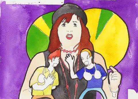
"Chavs"
From what I understand the magazine was going to be themed on subcultures of London's East End, and I was given 'chavs' almost definitely because of some illustrations I did for Amelia's Magazine a few years ago. I felt pretty uneasy, especially when looking online for reference, since so much of it is vicious, nasty and horrifically classist. So I tried to make my illustrations monstrous, a reflection of how 'chavs' are viewed, as well as trying to build some sympathy in too -- whether that was successful or not, I don't know.
Earlier sketches and drafts replaced the figure's heads with ant heads, or abstracted tribal masks, but in the end I went with what I know, which worked in my favour. Although, with more time to work on it, who knows what might have been.
Tuesday, 15 April 2014
Aquila Illustrations
Working on these illustrations was a lot of fun, and I also learnt a lot about Medieval armour and Elizabethan fashion to boot. Here're some of the images I created -- they're very different to the stuff I'd normally do, but that's all to the good, and have served as great confidence boosters for my current Big Project, a full length figurative graphic novel...
Sunday, 30 January 2011
Me, talking on camera, about #ACOFI
Here's me, talking to the brilliant Amelia Gregory about my life as an illustrator, to help promote the outstanding Amelia's Compendium of Fashion Illustration, which I was lucky enough to have been featured in! Watch the video, by the book. It's simple.
Saturday, 15 January 2011
#ACOFI - NOKI process

Amelia's Compendium of Fashion Illustration has been avaialble in the shops for a few weeks now, and with only a couple weeks to go until the official launch party at 123 Bethnal Green Road, I figured now would be a good time to recount some of what I went through when preparing my contributions...
I was asked to illustrate the articles for two designers -- 123 Bethnal Green Road (you can see that image and a preview of the article HERE) and Dr NOKI. I wasn't really familiar with NOKI before getting the assignment, but only a cursory glace at some of his designs convinced me that his designs were right up my street -- very subversive, and vicious in the way that they repurpose branded clothes. In conversation I've gone as far as to say that he's doing to modern clothing brands what Dada did to post WW1 art... which I don't think is too much of a stretch.
Immediately I wanted to make a very violent, dischordant image to match his designs, but I was also very aware that the image needed to sit within the framework of the other fashion illustrations that I'd done over the previous months and also within the illustrations done by the other illustrators. (Once I've got a few projects off my plate, I'm going to go back and illustrate some NOKI designs off my own back, I think).
In a departure from my normal work, I also didn't have a specific image to work from -- instead, Amelia went to the NOKI shop at 123 Bethnal Green Road and took some photos of the clothes, with some suggestions on how I might style them. I flicked through some old fashion magazines that my wife had left in the bathroom for an appopriate model to work from, and after getting the pose down I added the clothes on afterward.
Early on, I ran into a problem -- overtired from work and desperate to get the image finished, I added too much water to my paint when working on the face and in trying to correct it managed to eat away at the paper. This meant that the paint dried in a weird way, which in turn made it look like the model had a nasty rash, as can be seen from the original scan, below:
To correct this, I traced the face and hair, and painted and inked that (very, very carefully). I scanned that in, and through the miracle of photoshop, was able to replace the offending areas. The new face can be seen here: (I also took the opportunity to give her a little more personality than in the original, by giving her thicker eyebrows and the hint of some eyelashes)
The other major hurdle I faced was getting the background image right -- it's no secret that I photoshop the background in after I've done the figure (well, most of the time) but I couldn't get the right background. I was very, very tired when trying to get this right, and positioned as I was in a strange hypnagogic state came up with some very odd ideas. By the end, I'd gone from painting backgrounds to painting scenes from my favourite books, including Gravity's Rainbow and Call of Cthulu. I scanned these in, played with the colour balances and dropped the model on. Here's a selection of the images which came out as a result:
The final one chosen was a blue background, which was actually a detail from an illustration of the climactic scenes of All Familes Are Psychotic. My personal "favourite" was the one you can see in the bottom-right of the above selection -- at the time, I thought it looked like the model had just appeared from another dimension, like some sort of Fashion BVM, but it's actually a ridiculous image in a whole bunch of ways, especially when it's at print-size.Of all the images I've made recently, this is one of my favourites, though. And that's regardless of the work that went into it -- I just like the way it looks. And it looks especially awesome in the book, which every sane person should own a copy of... You can buy it here, didn't you know?
Thursday, 16 December 2010
This Week In Hopkins Towers
Also of particular not is that tomorrow (which will be Friday 16th December 2010) Amelia's Compendium Of Fashion Illustration is released! I'm really excited to see the finished product, as it looks like it'll be amazing. You should definitely go and buy a copy. Buy it NOW. Even if you have already...
Thursday, 11 November 2010
Amelia's Compendium of Fashion Illustration

A year ago, when I started this blog, I had no interest whatsoever with Fashion Illustration. I did what I did, and that was patterned black ink with bears and Appleheads and ghosts all over it, and I was kind of happy with that.
But over the past year I've been taking jobs at Amelia's Magazine for Fashion images, and have quickly built up a style I'm happy to work with, and have also developed a pretty healthy appetite for fashion illustration generally. I don't think I'll ever really get 'Fashion', but I love it when it's illustrated.
So it's with no small amount of pride that I've been included in Amelia's Compendium of Fashion Illustration, which is available for pre-order now. My pages include a selection of images produced for Amelia's, as well as a couple of new ones which I'm really proud of, that I might share once the book's out, but certainly not until then. And there's a pretty long 'process' blog behind the new images... again, I'll save that for now.
Here's the official blurb for the book. Everyone should buy a copy, because it'll be awesome.
Amelia’s Magazine has become a must see website for upcoming independent and ethical fashion designers, all illustrated in wonderful technicolour by our talented team of illustrators.
Amelia’s Compendium of Fashion Illustration book brings together the best illustration from Amelia’s Magazine alongside the best new ethical fashion designers, all in a gorgeous coffee table book with a stunning pearlised cover designed by the Arizona based artist Andrea Peterson.
The book offers inspiration to aspiring fashion designers, illustrators, art directors and anyone who is interested in ethical fashion design. It features interviews on the design practice of the chosen 30 illustrators (who were chosen via this open brief) alongside nearly 50 boxout profiles of the very best in ethical fashion design, including clothing, footwear and jewellery.
Featured ethical designers include Ada Zanditon, Beautiful Soul, Christopher Raeburn, Dem Collective, Edun, Fifi Bijoux, From Somewhere, Goodone, Henrietta Ludgate, Joanna Cave, Lu Flux, Minna, Nina Dolcetti, Partimi, Prophetik, Romina Karamanea and Ute Decker to name but a few.
Amelia’s Compendium of Fashion Illustration comes as an eminently collectible limited edition softback with a pearlised front cover. Beautifully presented and entirely ethical in production, the book is printed in the UK using environmentally responsible vegetable inks on FSC approved paper.
Perfect for fashion designers, illustrators, artists and anyone interested in the world of ethical fashion design, this will make the perfect Christmas present for that creative person in your life. (read on for ordering information and some very special Christmas offers!)
Tuesday, 21 September 2010
First Half of London Fashion Week
Designs by Julian J Smith for On|Off - Original Article I especially like illustrating for Amelia's because practically a pre-requisite is that I need to work in colour (except for one instance, featured in my last blog post), which is really liberating. Now, when given any piece of work to do, I always think about working in colour, and only go for B&W if it actually suits it, and not the other way around, which is how I used to work.
Because my approach to each set of illustrations is slightly different, I've started drawing eyes as simple circles to kind of 'trademark' my work -- despite what else is going on, if the model's got blank circle eyes, I did that picture.
Here's the illustrations I've done so far -- there's another set waiting to go up on the site, and I've got some more to work on tonight, and hopefully the night after, too)


Thursday, 9 September 2010
Three new illustrations at Amelia's
This week I've been very busy for Amelia's Magazine, doing two illustrations as part of their previews for London Fashion Week, and one of the band The XX for their Mercury Music Prize preview. I really like two of them (Felicity Brown/Simone Rocha and The XX), and despair a little for the other (Cooperative Fashions) -- the despair arriving on the back of the fact that I did it when very full of illness, so my usual critical faculties were out.

Cooperative Designs (Interview as part of run-up to London Fashion Week)
Friday, 13 August 2010
Wayne Hemingway Process
This illustration of Wayne Hemingway was done for an article at Amelia's Magazine about 'Vintage at Goodwood'. It started off as a portrait done in the same style as my recent ones of Alan Moore and John Stonehouse, but Amelia suggested I try using colour... two hours of the paintpot tool in Photoshop and this is what we get. I don't know what possessed me to go with such a lurid blue... all the other coulours are relatively tame (well, except the reds and pinks in the words). Below are the original black and white ink drawing, and the photo I worked from..jpg)
Tuesday, 3 August 2010
Process for Unearthing Blog (potentially uninteresting)
I recently attended the performance of the multimedia collaboration 'Unearthing' by Alan Moore, Mitch Jenkins, Adam Drucker and Andy Broder, and wrote a blog about it for Amelia's Magazine. I also did two illustrations (posted here) and grabbed some stills from some video.The illustration of Alan Moore was relatively straightforward (posted above). I had in mind the starting image I wanted to use, and that I wanted to do it in the style I'd used for my Jon Stonehouse image for Cut-Click's mailart exhibition. Once I'd pencilled the broad features in, everything else fell into place. I was going to include a lot more text, but when it comes to Alan Moore, what do you choose? In the end, I just put the word 'Gods' above his right eye (referencing his use of Magick and one of the themes of 'Unearthing') and stuck a 'V' in there (as in 'V For Vendetta', but I suppose at a stretch it could also reference Thomas Pynchon's 'V.', which Moore is apparently a fan of.). There's also two ghosts snuck in there. I actually did most of the beard inbetween multiplayer matches of Bioshock 2.
The one of Crook&Flail (below) was more difficult. Crook&Flail is the moniker under which Adam Drucker and Andy Broder composed the music for 'Unearthing'. There's one image of them together as Crook&Flail out there on the internet that I could find, and it wasn't very interesting, and I couldn't work from it very easily, so I went looking for images of them apart which I could combine. There are loads of Drucker (who also goes under the psedonym Doseone) many of which I was familiar with already, but none were really suitable, and there are very few of Broder. I ended up trawling Flickr for images I could use... I really should have tracked back to their owners (job for later this week). I wasn't happy with the composition at first, to the point where half-way through I was going to give up, but a session of working on it in front of Ghost Dog set me right. The reliance on black and white stripes was intentional, for two reasons: 1) Referencing the style of the Egyptian Crook&Flail that they're named after 2) Alluding to Doseone's old band Subtle.
I decided not to do an illustration of Mitch Jenkins because... well, it din't occur to me. That's kind of awful. Maybe I'll do one and add it here, then retcon this blog post to look like I'd done it all along?The still was taken from a video I took with my new favourite toy, and Flip camera my Dad got me for my birthday. I only filmed about 30 seconds of the performance, because I realised that the screen, as I was looking at it, was lighting up my face, and making me very obvious to the performers.
I had a very hard time writing the blog, though. It was the most concentrated piece of writing, other than emails, I'd done in a very long time (probably since Nanowrimo 2006). Progress was hampered by: 1) the fact that I had so much that I wanted to write about, but couldn't get it all down succinctly enough* 2) the notes I'd taken got put through the washing 3) the time I'd set aside to write got eaten up by getting slightly drunk at a BBQ and falling asleep on the living room floor. Similar to my problems with the Crook&Flail illustration, it came down in the end to just holing myself up on Sunday night after my wife and son were asleep and banging on the keys until I was happy enough to send it (adding the usual caveats in the submission email to Amelia that if she wanted to reject it, she could).
To my relief it was posted. (HERE, IF YOU'VE NOT FOLLOWED THE LINK ABOVE YET) Since it was posted, I've of course noticed things that were wrong, or I'd change now. But it remains something I'll be proud of for a long time now, whether anybody else reads it or not.
* One thing I desperately wnated to shoe-horn in, but wasn't sure whether Amelia's audience would appreciate is the fact that Ciaran O'Keefe was in the audience! I clocked him as he walked past and desperately wanted to run over and shake his hand and tell him how much I respect his work despite the fact that Most Haunted gets worse by the episode (and that I haven't watched it for about a year)... but I was having a conversation with a chap named Ben and the moment passed.
Monday, 2 August 2010
Amelia's contribution round-up
Magazine. Here's a quick round-up (in no particular order):

I did this picture of comedienne Deborah Francis White as part of a round up of the comedy tent at Latitude Festival, as well as one of Adam Lambert.

This image was done for an article about a Q&A with Peter Blake, and I also did a portrait of him, which you can see by following this like: LINK The St Pepper's thing was in response to the fact that apparently, Blake is tired of talking about the cover he did for St Pepper's Lonley Hearts Club Band (which is covered in the article) -- it's very different to what I normally do, because it doesn't include using a pen ANYWHERE.
I've also had a contributor's profile added to the site. I spent as long looking for a picture of myself that I didn't hate as I spent on the illustrations for the Peter Blake article, and looking back, I still look like a bit of a numpty.
Sunday, 11 July 2010
Newstuff July2010
It's been a very long time since I last posted anything, and it feels like I've got a lot to update...I've done some more illustrations for Amelia's Magazine, the best of which is one of Seasick Steve, above. I don't know why I did him in green, but I think it looks cool.
I've also sent a picture of John Stonehouse to Magpie Markets as part of Cut-Click's travelling mailart show. It took me ages, and I loved it, but for some unknown reason I didn't scan it, just took the crappy photo presented below. I'm hoping to do a lot more of these in the future.

Oh, aand in very exiting news, Cut-Click's first printed issue is on sale here: http://cutclick.bigcartel.com/ and it's AWESOME. Really.
I've contributed a panel to Abstract Comics's ABCOLAB2 project, which didn't take very long but was very fun to do:

Aaaaaaand I've posted three new pages to The Intercorstal!
Sunday, 13 June 2010
Learning = Pain
Recently, that's involved taking jobs from Amelia Gregory for Amelia's Magazine, as I covered in my last blog post. With each assignment, I've grown a little more confident in spreading my wings. And with this growing confidence, I took an assignment to illustrate an interview done with Robin Ince and casually asked if Amelia had any idea for what she'd want. The response I got was a perfectly reasonable "...maybe something inspired by crabs on the rampage with musical instruments and people in trees?"
And so, having done the housework and put my son to bed and had a beer and a coffee, I went on a hunt for images of Robin Ince and crabs, thinking I'd do a picture of Mr. Ince being terrified by an army of marauding crabs. In very quick time I got an idea of how to draw crabs... they're pretty easy. And I found this image of Robin Ince, which could look like he was scared of some crabs:

And then I set to work... I figured I'd do something colourful, so after I'd done what I thought was a pretty passable pencil draft, which I defined with sanguine ink, I set to painting. Once I thought I'd done enough painting, I broke out my black pens and set to working up what I had. Once I was finished, I put it to one side, played some PS3, and went to bed.
At 6:30 the next morning, woken up by my son, I came downstairs and found this:

"Oh GOD... it must be early in the morning, because that looks terrible". When my wife came downstairs, I held it up and said "Look at this shit, it's probably the worst thing I've ever done, and I'm including the time I spent as a child". The response I'd hoped for was "It's not too bad, you must have looked at it for too long."
The response I got was: "Well, honey... you're good at what you normally do. Why not try that?" I was understandably appalled. How dare she limit my artistic and creative freedom?! Who is she to try and put me in a box?! Justifiably, I marched out of the room, outraged and indignant. As soon as I was through the door, I knew that she was right, and what I had to do...
First I watered the plants, then cleaned the washing line, changed the bed sheets, cleaned the kitchen, had a sit down... Then, I got back on the internet, and looked for some different pictures to work from, got the printer out, then my lightbox, then worked through my usual process, which involved creating grids with my Tesco Value Geometry set, reading through the interview for interesting phrases, working out how to illustrate those individually, placed those in pencil on the grid, then slowly, bit by bit, working up in pen... and, after about four, five hours, came out with this, which is much better:

The moral being... um... Don't draw bad pictures? Well, yes, but more than that, I need to remember to be true to myself, and to take my bloody time over these things.
Lesson over.
Wednesday, 9 June 2010
Illustrations for Amelia's Magazine
Each illustration is very different, and certainly a departure from what I'd normally do. There's a fourth illustration which may or may not make it into a blog which may or may not ever get written...
Here they are, along wwith links to the blogs that they've been included in...

Gordon Brown, for a blog about the election

An aristocrat culling grey squirrels, for a blog about Robin Ince's School for Gifted Children

Two illustrations of the fashion of Charlotte Taylor, from a blog about Northbrook and Salford's show during Graduate Fashion Week (only the one on the left got used)
Saturday, 29 May 2010
Intercorstal News Update 29th May 2010
I've just returned from a 16-night cruise, taken with my wife and her family. While I was away I finished five pages of The Intercorstal and some other very different pictures. The other pictures will come in a later post, but for the moment I just want to talk about The Intercorstal...The quest for a stapler hefty enough to compile the first minicomic is complete -- it was waiting on my desk when I got back from holiday. Now I just need to print it out, and then I'll start sending copies out to those people who've requested a copy, and also to people who's opinion hasn't yet been offered but I'm interested in getting.
The five new pages have been uploaded at The Intercorstal blog. The latest three (Pages 36, 37 and 38) are among my favourites so far, and I've decided to talk about them a little here.
Page 36 is inspired by Abstract Expressionism, in particular Rothko, and I actually find it hilarious in its audacity -- I'm unsure as to whether anyone else will.
Page 37 is again a little private joke with myself: Because the ruler I had with me was only 6inches long, that's how long I made the image, but kept the page at its usual 8 inches, therefore referencing the process of creating the page -- in a similar way to how many Abstract Expressionist images exist principally to express the act of painting, the height of this page's content expresses the act of measuring. Again, not sure if anyone else will get the joke, or the reference. This page also features my favourite ever ghost, and some abstractions based on a photo I took in Venice of a boat moving past the city.
I came up with the idea for Page 38 while half-asleep one afternoon, while waiting for some water to cool in order to make up my son's milk. The sixteen little boxes are abstrations based on photos I took around my cabin -- the bases of lamps, the corners on TV cabinets, things like that. The cross in the middle is a location in The Intercorstal -- a mountain side dotted with Wind Houses with what is either wind or sand in the background. For the record, I know what a Wind House looks like, but don't know what it does, much the same as a hORSEhOOK.
Those that know they're getting a copy of the minicomic: keep your eyes peeled for the postman. Those that don't... well, keep your eyes peeled anyway, you might have some important credit card bills or something.
Saturday, 8 May 2010
News Roundup May 2010

After my last post, in which I was convinced that the Intercorstal mini-comics were about to be sent out, I came a-cropper of not having the right size stapler for the job. This is on order now, and I expect to start sending copies out to people (both those that responded to the offer, and some who didn't) by the end of the month. Trust me, when you get it, you'll be amazed... that it took so long to sort out.
I've had an illustration included in a blog by Amelia Gregory at the exemplary Amelias Magazine -- it's the one of Gordon Brown about halfway down the page. I'd post it here, but then there'd be no incentive to go and view it in its natural habitat, would there?
In sad news, Trolleys In Odd Places had it's last ever post a little while ago -- I made a little video to see it off which has lots of photos in it. Since posting the video, I keep finding other photos that really should have gone in there, but oh well. Now I'm looking for something else to make into a regular, focussed blog. I'd ask for suggestions, but knowing me I'd reject them all.
I've been finding pictures here and there which for one reason or another haven't found a home. above and below are some picture I did around the time of Operation Concrete that I didn't do anything with.
Lots of fun things coming from me soon, that I've not mentioned here... will do soon, promise.
Word to yo' moms.
Gareth